Dev Diary - Project 2: Trying to Finalise the Rulebook

For this project, we are adding many new features and changing many of the existing ones, so a new rule book needs to be made. The class is working on it together and has been playtested a couple of times. The first version of it, was basically a dump of all the core game rules with headings. As you could guess, the playtest didn't go that well. There was no start point or rules for how to game flows. Who does what when and what restrictions are there. The second version, was a better laid out version, detailing setup rules, phases and what each player does at the end and during a turn. My team playtested it with a Studio 2 student, who was a great help. Basically, the rule book was missing quite a few instructions and wasn't new player friendly.

The problem, was that the rule book was written from our (the class') perspective, so many of the small details were just ignored. On the front page, it talks about things like refreshing HP and AP. What's HP and AP? Another problem with it, was that there was no major start point. The rule book began by telling you how to set up the 5 initial hex's on the board. Every step from when the player's open the box should be written down. Where the cards get placed. Are they shuffled? Face down? How do the bar cards get determined? There wasn't even anything in the rule book about scenario's or crisis'.

This is all stuff that we didn't think about. Again, from our perspective, the playtesters didn't have to worry about setting up the board as it was already there for them when they arrived. Going on with this, there was a big problem, where our tester was constantly flicking back and forth between pages to find out information about different things. Player movement, tile placement, etc, were all under different headings on different pages. There was no flow of information. It didn't read like a book, where the information you needed to play the game was presented in a linear fashion.

So, what did we get back from playtesting with the rule book? Quite a big actually.

  1. Write the rule book so that it reads at an understanding of a totally new player.
  2. Write it in a way, so that the player's don't need to be constantly flicking through pages. Make it read like a book, from the start to the finish.
  3. Have clearer set up instructions. List off where cards go, when to draw player cards and when to pick/read the crisis.
  4. Also another thing is to not make it too long. As much as we'd like to dump all of our dot points and information into this rule book, we do need to keep in mind attention span. Reading a 10 page rule book will be boring and you'll probably forget half the rules by the end of it. Having a short, but concise rule book, with solid set up instuctions and easy to understand language is key.

Dev Diary - Project 2: Player Experience

Player experience is a thing that we need to constantly be thinking about with our scenarios. A quick rundown of our scenario is:

Your crew crash land on an alien planet. The locals are quite primitive and on edge about their new, out of this world neighbours. You need to gain their trust, while at the same time trying not to freak them out, or worse.

Start Crisis: One of the aliens is coming to search the ship. Hide the weapons so that they don't think you're hostile.

A Crisis': One of the aliens came on your ship at night and killed themselves on a piece of machinery. Dispose of their body parts and fix the machine.

B Crisis': The mining laser turned on after the crash and is making the locals sick. Turn off the laser and fix the ship.

C Crisis': The leader of the aliens has come to request a statue be made for him. Quickly scrap together a statue.

End Crisis: Your ship malfunctions and is about to blow. Cobble together a contraption to launch the core into space, so that you and the natives don't all die.

The experience we're going for is to "keep the players on edge". Pretty much the players need to feel that they are at risk of being seen as enemies and then being killed. This is done through times crisis'. All the 3 story threads have at least 1 timed crisis, drilling in home this experience. The timer though is quite large, giving the players enough time to think about their actions, yet still having that thought of taking too long be in the back of their minds.

Hiding a dead body, hurrying to fix an out of control laser, rushing together a statue and getting rid of a bomb are all things that will make people panic and rush to complete. The players are fighting against the alien's suspicion of them, constantly trying to make things right and appeal to their new "friends". It's not complete though. The experience is something that we still need to further integrate into the scenario, so that the players can feel it, rather than be told it.

Dev Diary - Project 2: Hazard Tiles vs Hazard Tokens

Last week in class, we were having a debate about what's better. Hazard tiles, or hazard tokens. Hazards in the original Up Ship Creek game were important and added some risk into the play. For the hex based game, we currently have the token system in place, yet there are a couple of people who want the hazards to be tiles. Here's a run down the the 2 systems:

Hazard Tokens

1.PNG

Every round the 3rd player draws a token or anytime during gameplay, a player can draw a token for 1 AP. The token is then placed on any adjacent tile around the player and can be used when the player enters that hex. A hazard token though, triggers instantly when the player enters the hex (just like the hazard rooms in Up Ship Creek). They draw a hazard card and once that is done, the token gets discarded.

Hazard Tiles

2.PNG

Hazard tiles are mixed in with both the environmental hex deck, and the ship deck (i'm not 100% sure on that though), and have a chance of being drawn when a player draws a hex from the deck. A hazard tile is a permanent hazard zone that will be tied to the hex, so if a player enters the hex, a hazard card will be drawn. 


2 systems, each come around differently, and change the experience of the game. I for one was on the side of the hazard tokens when this debate occurred. Why? Well hear out my reasoning.

With hazard tokens, you take a risk (picking a token) and if it's not good, you are forced to place it down. Whereas with the tiles, if you draw a hazard token, yes you took a risk, but you don't have to place it. You can keep it in your hand for the entire game and if at the point where you need to place it, it's not that bad. You can choose where to place it. So if there's a corner of the map you don't go, just slap it on there. Pile up your hazard tiles over there and never worry about them. With the tokens though, you need to place them, and adjacent to you, so it will most likely be in an active area.

The tiles to me just seem like an inconvenience, whereas the tokens seem like a threat. In the end though, the final outcome was that there were going to be the hazard tokens, but they're permanent. This creates the risky nature of the tokens, with the permanency of the tiles.

Dev Diary - Project 2: Node Blocking

In the original Up Ship Creek game, node blocking is a thing. You cannot move onto or through a node that is being occupied by another player (unless you are the Contortionist character). With the hex based game though, it's different. There are 2 distinct areas, one being the ship tiles and the other being the environmental tiles. What we decided on, was that the ship tiles had the original node blocking rules, while the environmental tiles, are still up to debate. 

It's fairly agreed upon that in these outside tiles, node blocking wont really be a thing, that players can move through nodes with other players in them, but at a cost. We talked about it briefly, stating that a player can move through a node with another player for an extra 1 AP cost. But what does that mean? From what I see, there are 2 different ways that this can go down, each with their own pros and cons:

  1. Moving onto the node of another player costs 2 AP. This would then mean that 2 players inhabit that node.
  2. It would cost 2 AP to switch nodes with an adjacent player. This mean only 1 player can inhabit a node.

The first one is the option most people agree with, yet when you bring up the fact that it would need to have a rule for 2 people to be on a node at once, there's disagreement. When you say that it costs 2 AP to go through a node with a player on it, most people would picture in their mind, a player moving past the node and on wards with the other player in it. But what if you are next to them with only 2 AP. Can you still move past them? Or do you just go onto the same node as them? If so then there needs to be a rule for multiple people in a node at a time. Can all the players be on a node at a time? If so would it cost 3 AP for the third player to join? If you say no, only 1 person can be on a node at once, yet you still agree with the 2 AP cost to move past them. Then that doesn't make sense. It wouldn't cost 2 AP to move past a player, node blocking would just not exist.

Capture.PNG

The second option was one that I thought about. What if you wanted to go onto or past a node that a player is on, but it would cost you an extra 1 AP (so 2 AP to move) to switch places with the player in your way. If the player your trying to pass is on their way to a goal, switching with them will set them back a node. It may seem bad on their side, but since it's a co-op game, it can be agreed upon. Generally, if you are setting out towards a goal, all the players would picture their turns ahead of time. Yet if you are clumsy and just go straight for a goal, then there might be a problem when later on, 1 player needs to get past another, as they still have AP and need to get to a goal. Spending 2 AP to get onto their node and to set them back to your node, will in my mind, be balanced. There is the 2 AP cost in the first place, so that it isn't as easy as just moving around normally, and there is the set back, which can be punishment for poor planning.

222.PNG

Thematically, the node blocking rules in and out of the ship seem pretty good. Inside of a ship (especially a crashed one), it would be crammed, so moving past people would be hard. Whereas, moving around and past people outside would be easier as you are in the open.

Dev Diary - Barnstorming: Car Animations

Since you could call the game "arcady", the movement and interaction of objects don't need to look the best. Although I believe adding these two animations (seen below), it adds much to the experience and overall polish of the final product. I went over the game feel aspect of the animations here. For now, lets talk about the process of making them.

GIF.gif

Unity's in-built Mecanim animation system was used to create these. For both animations, the only properties that are being modified are the position and rotation of the model. The animation also isn't applied to the player's main object, but the 3D model inside of it. This is because modifying the position would clash with the knockback and moving systems already applied to the player.

112.PNG

This is the collide animation, played when the player hits a solid object (it lasts 0.2 seconds). I knew that I wanted to make the car lean backwards as if it's been snapped backwards. It took a few iterations to get it the way I wanted. The problem was that the initial rotation backwards was too slow. Making it only 2-3 animation frames causes it to look fast and snappy, just the way you want it. 

2323.PNG

For the slowdown animation (0.15 seconds), the car leans forward as if its front wheels are going into a pothole. This one didn't take as much iteration as the previous animation as I learned from my mistakes. The lean forward is slow than hitting an object, since they are slowing down and falling into a pothole. This animation is less nessecary than the collide one since for hitting a pothole and slowing down, the impact is not as large. Although having it doesn't hurt, and it adds to the feel of the game.

Dev Diary - Barnstorming Remake: Interactions

A key component of Barnstorming is interacting with objects. Going through barns and colliding with obstacles is what the game is made up of. So in my remake, doing these things right was important.

333.PNG

Each interactable object (gas stations, potholes and fallen trees) has a trigger or collider, yet in the case of the gas station, three. The gas station has two seperate empty game objects attached to the model. One is for the solid obstacle colliders, and the other is for the passthrough trigger.

The "Collider" object has two box colliders which are for the building on the station and for the gas pumps. The "Passthrough" object has one box collider set as a trigger. The "Collider" colliders are tagged as "SolidObstical". While the "Passthrough" collider has a GasStationPassthrough script which checks for the player driving through.

3333.PNG

This is the code above. It simply checks for the player (who is tagged as "Player") and then calls the onGasStationPassthrough event, which flips up the flag, plays the sfx, counts down the gas stations remaining and triggers the UI to pop.

321.PNG

Here is where most of the interactions get triggered from. It's attached to the player script and they are checking for two things. Objects tagged as "SolidObstical" and "NonSolidObstical". Solid obstacle are gas station colliders and fallen trees, while non solid obstacles are potholes.

If you go over a solid one, the player knocks back, the particle effect triggers, sound effect and animation are played. The camera shakes also. If you go over a non solid one, the car slows down and the slow down animation is played. You can read more about the knockback and slowdown systems here.

331.PNG

The farmhouse has another box collider on it, set as a trigger. The player doesn't manage this interaction, but the Farmhouse.cs script does (which is attached to the farmhouse). 

It's similar to the GasStationPassthrough.cs script, yet all it does is call the end game event, essentially ending the game.

Studio 1, Project 1 - Post Mortem

Overall, I was impressed with the final product. It lived up to my expectations, yet not without some flaws. One of them, was the structure of the level generator. For the three different levels, the procedure of generating the level was the same, with the only difference between the levels being the visuals. The placement of objects generated by the script, was not perfect. In fact, I wasn't that pleased with it. The script followed rules of how and when to place objects, yet many other rules that were needed weren't included. Potholes spawned inside of each other, in-front of gas stations and even in them. Gas stations followed a rule that no more than two of them can be spawned in a row, yet sometimes two would spawn then a gap, then another one. Sometimes even, gas stations wouldn't spawn for periods of fifteen seconds. Also, since it was procedural, there was not really a proper learning process for the player. There could have been an odd combination of logs and potholes which would have not been great for a first time player.

So how could this have been avoided? Well, the obvious answer is to better design the level generator, and yes, that would have probably fixed most of these problems. I had a function in place to check whether or not a pothole was in the position of an already existing one, yet it never really worked. Iterating upon that would have probably fixed the pothole inside pothole problem. In the case of them being in-front and inside gas stations, I could have made it so that if there was a gas station, potholes can only spawn on the opposite half of the road from the station. This way, going through a gas station wouldn't punish the player, yet missing one had the chance to. The placement of gas stations in a row was a problem that I believe is just due to the random number generator. I could have spent some time making a function that returns a random number that hasn't been used in like the past two iterations. This would make the game seem more random, while truly being less random. The learning process for the player is very important. I did have somewhat of a subtle, self-taught tutorial at the starting city tiles, yet when the game first truly begins, it is different every time. I could have had the first ten tiles or so for the three levels pre-made, so the introduction of fallen trees and potholes was natural and easy for the player to understand. Further additions and modifications to the level generator would indeed fix these problems. Yet it seems due to thinking over it or at many times dismissing it as un-important, eventually caused me to write this today. 

fffff.PNG

Now onto something that I liked quite a bit with the project. Not the 3D models, or particle effects - I did very much like them though, but the biggest shocker for me was the change in font. Before I was just using Unity's default Arial, white font. It didn't look good at all. I was going for a 1940's theme and the font made the game seem too "prototypy". So one day, I looked online and found a font called "Berlin Email." Adding this font to all the text elements and changing the colour to a white/beige/yellow colour made a large improvement. The next time I make any game, no matter the genre, setting, 2D or 3D, big or small, the font will be further forward than it was before. Because for me, what made this game seem less like a prototype, and more like an actual product, was the change in font. It also helped set the 1940's theme nicely, as the only other thing to give it away was the design of the car and the chance that the player even knew who Edward Hopper was. Spend time thinking about what era your game takes place in, or what era it's trying to emulate. Since players are always looking down at the font, putting into their minds the time period or feeling you want them to feel through the font can make a big impact.

Dev Diary - Barnstorming Remake: Teaching the Player

This Dev Diary will be less about the actual code or assets of the game and more about the design in terms of teaching the player how to play the game. There's not a lot of it though, yet there are 3 main systems that are taught to the player before they leave the city tiles. One of them is explicit and the other 2 are more subtle and might not be caught on by some players. These 3 systems are:

  • Boosting.
  • Gas Stations.
  • Movement.
d.PNG

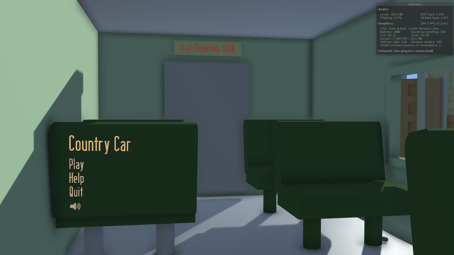
When the camera pans from the inside of the train to look out the window at the game space, the player is motionless, with this text in the middle of the screen. Pressing the spacebar starts the game, as well as momentarily boosting the player. They may feel it and decide to press it again later on to go faster.

Before the player can really move, they drive through a gas station, reducing one of their remaining gas stations. This is a very blatant way of teaching the player how gas stations work and the objective of the game, yet it is probably the best without having a text box on the screen.

Finally, as the player drives through the empty city for around 5 seconds, the empty road above and below them could indicate that they can move there. Pressing up to move upwards and pressing down to move downwards would be the most obvious way to do it. This could lead the players to indeed moving around, waiting for the game to truly begin.

So before the player even sees their first obstacle, they already know how gas stations work and probably have an understanding of boosting and movement. I could have had a popup screen displaying the controls and objective of the game. Yet with my method, it shows rather than tells. You can tell players all you want about how the game works, yet when they get in there for the first time, putting that theory into practice is not the same as learning it for yourself.

Dev Diary - Barnstorming Remake: Player Controller

11.gif
22.gif

Look at the way the car moves in the 2 gifs above. The first gets a direct input from the keyboard, getting a value or -1, 0 or 1. It applies that to the z velocity to create snappy movement. The second gif, shows using Input.GetAxis("Vertical") and applying that to the z velocity. This creates the sense that the car is heavy and takes time to build up speed.

I went with the first one though, because as much as anyone would like their games to feel "realistic", you need to decide what is best in creating the experience. Barnstorming is a fast paced, tactile, "arcade" game. Players need direct input on where they will move and when. 

Once the input is saved as a float, it calls the MoveVertically function. This takes that direction and applies it to the car's rigidbody. There are other ways movement could be done. Adding force is an option, yet it would be even more floaty than the 2nd gif up top. Altering the transform directly would be a faster way to do things, yet since we are using the physics system and colliding with things is an importand aspect of the game, we need to use a rigidbody function.

For accelerating and decelerating, the only input read is the spacebar. If it's pressed, then the Accelerate function is called. If it is released, then the Decelerate function is called.

All this does, is move the x velocity of the car up to the max speed or down to the min speed over the duration of timeToMaxSpeed or timeToMinspeed. I tried using Mathf.Lerp instead of Mathf.MoveTowards, yet lerping it would result in problems of the car not entirely reachig the max speed.

1.PNG

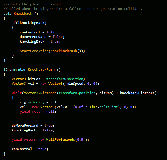
The most complex system in the player control is certainly the knockback. When the player collides with a solid obstacle, the Knockback function is called.

It first checks whether or not we are already being knocked back. If not, then we disable all control of the car and stop it from moving forward.

Then the coroutine KnockbackPush is called. This moves the car backwards until the distance between the car and the hit position exceeds the knockbackDistance.

Then after that is all done, we wait half a second before allowing the player to regain control of the car. This is so that the player can't move the car up and down while it's basically stationary. It looks weird and ruins the illusion that the car is actually moving.

1.PNG

When the car hits a pothole the Slowdown function gets called. All it does is first make sure that the car is not knocking back, before setting the horizontal velocity to close to 0. If this knockback check wasn't there, then if we were to slow down while knocking back, the car wouldn't move at all. It would be stuck.

Dev Diary - Barnstorming Remake: 3D Human

The model to the left is of a human (by best attempt) and is used later on in the game for when the player gets closer to the house. 

This model took me the longest out of all the others. Why? Because it was my first time ever creating a humanoid. Before I made trees, a car, logs, etc. For some reason creating humanoid anything really, is something I struggle with.

Even with making pixel art, the hardest thing to do is creating the characters. I believe that when making these things, it is hard because we want them to look perfect.

They are the avatars that we focus on the most when playing games, so if they are off, people will notice.

fdsafdsa.PNG

The process started with a simple cylinder. Then I divided the base of it into 2 and extruded out the faces to make the legs. Edge loops were inserted around the torso and legs so that the body could form.

The feet were done by selecting the front few faces and extruding them outwards. Quite a bit of tweaking vertexes was done so that the foot shape came out.

The arms were the hardest part. Like the legs, they were extruded from the top of the cylinder and initially put into a t-pose. Since I wasn't going to animate the model, a t-pose was a bad idea, so after a while of moving individual edges, faces and vertexes downwards the general size of the arms were complete. From there, adding edge loops and moving vertexes around was done to give the arms a similar look to real ones.

dddd223232.PNG

A problem I did run across though was somewhere in the extruding process. It seems some of the faces were missing or are backwards. I'm not an expert on the subject so I can't track down the exact reason why it happened.

Once the model was complete, it was added into Unity and the material was applied. For it to look at the car though when it goes past, that was the easy part.

transform.LookAt(target.transform);
transform.eulerAngles = new Vector3(0, transform.eulerAngles.y + 90, 0);

We make the model use the LookAt function to look at the target, but that also rotates on the x and z axis. We don't want that. So we set the x and z angles to 0, while adding a 90 degree offset to the y axis. This is only because the forward direction on the model was not the direction the human was facing.

Dev Diary - Barnstorming Remake: Screenshake

From reading the other posts, it can be seen that player feedback is a pretty important thing in my mind. It adds to the experience and provides instant confirmation on things happening. The player shouldn't need to look at the number of gas stations remaining to see if they did indeed go through it or if it was a miss. There should be both visual and audible feedback to tell the player.

So in my game, when a player hits an obstacle, the screen shakes. The camera is in a train and makes no sense what so ever for it to do so in a real world situation. But this is a game and sometimes doing things that would for certain never happen in the real world, makes the game world more believable.

The screen shake isn't seen at its full potential in the above gif as the frame rate is too low. In-game though, the camera jitters along the x and y axis for a short period of time. So how does this work?

Well when the camera is called to shake the screen it requires the sender to provide 3 values. A duration, an amount and an intensity

  • Duration is the total time the screen shake will take place for.
  • Amount is the distance between the shake points.
    • A low number would make the shake small.
    • A high number would make the shake large.
  • Intensity is the speed at which the camera moves to each of the shake points.
    • A low number would make the shake slower.
    • A high number would make the shake more violent.

So how does the screen actually shake? What's the code behind it?

  1. First we get the initial camera's position and make that the original position.
    1. This will be used once the shake has ended.
  2. Then we set the target position:
    1. targetPos = originalPos + (Random.insideUnitSphere * amount);
    2. This returns a value in a spherical radius around the camera.
  3. Then we simply lerp towards the target pos at the speed of the intensity.
  4. Once we're at that, repeat the above steps and stop once the time elapsed is greater than the duration.
231232w.PNG

This is one way to do camera shake. I know that i've been using this same system for my games in the past and it works well. Of course there are many other ways to it but this is the way I know best and it's very customisable. 

Dev Diary - Barnstorming Remake: Particle Effects

In the game, there are 2 particle effects. The first being the smoke coming out of the exhaust, and the second being the one when the car collides with an obsticale.

I really don't like the look of the default particle texture, so I changed it to the sprite default one. This makes white, square particles which in my opinion fit well with a low poly game.

The exhaust particle effect simply emits particles backwards, with them being a mix between light grey and dark grey. They fade out over time and have some random movement along the x and y axis. Also, there is a gravity modifier, moving the particles up into the air and a rotation applied to the particles.

One cool thing though, is that the rate of emission is tied to the car's horizontal velocity. The formula to calculate that is:

rate = Mathf.Pow(rig.velocity.x / 2, 3)

This is an exponential curve which increases quite a bit as the speed increases.

When the player collides with an object, along with bouncing back a sound and particle effect is played. The particle effect is quite important as it provides the player with visual feedback and makes the world seem whole. When you hit something like a log, you'd expect there to be a puff of dirt, wood particles and smoke. 

This particle was made in a similar way to the smoke one, just with the particles emitting from a sphere and disappearing quite quickly. I didn't want to clutter the screen with the particles sitting around for a while as even a small duration of them tells the player what they need to know.

In deciding what colour to make the particle I was a bit stuck. The player can hit both fallen trees and gas station colliders. Both are different colours. So I decided to go with a similar colour to the ground. It looks like a dust cloud and is much easier than figuring out what the player hit, then changing the patrticle colour based on that.

Dev Diary - Barnstorming Remake: Creating the City Tile

In previous builds, the player starts out in the forest and plays from there. What I wanted though, was for the message of leaving the city to be clear. So I had the first 6 tiles of the game be set in the city, introducing the player to the concept of gas stations and allowing them to move around to get a feel for the place, before they are chucked into the world.

dddd.PNG

The overall position and size of the wall colliders are the same as the forest tile. It's just the visual look that's different.

  • The road is dark to look like tarmac.
  • The wooden fence is replaced with a concrete barrier.
  • The trees are replaced with 2 different buildings.
  • And there is a lamp post.

I started off the buildings with a simple cube. It was stretched out in scale and for the building to the left, I added some edge loops and extruded a face upwards. It created a second layer.

Then I made thin pillars and placed them at the edges of the buildings. This is because looking back at images of those old fashioned buildings, their architecture is quite complex and there is a lot of detail.

Since I went with a low poly style, doing these pillars added some of that style and made them not boring to look at.

dddw.PNG

The lamp post was a bit more complex. Making it curve at a 90 degree angle was not as easy as I expected.

What I done, was I selected the top face of a cylinder and extruded it out a bit, moved it along the x axis and rotated it a bit. I done this 2 more times until it started to go horizontally, essentially making a low poly curve. 

The light bulb was just a sphere object, squashed down on the y scale to make it look like an oval.

dsassss.PNG

In-game, the light bulb has material which has emission enabled. This makes the light bulb appear to glow a bit. For on the Midnight level, these lights hand a spotlight attached and making the object emit a bit of light adds to the illusion that it is the source of the spotlight.

For the materials of the City Tile, it is just like every other material in the game. The metallic and smoothness values are turned right down to 0. This makes the surfaces not look shiny or reflect light at all. Having it do so would first of all, make the game slightly laggier (not really an issue), and second of all: follow the art style. Edward Hopper's paintings had colours which were pretty flat, de-saturated and not really that reflective.

Dev Diary - Barnstorming Remake: Level Generator

All 3 levels of my Barnstorming remake are made by generating the level in real time.

dddw.gif

From seeing the gif above, it shows that as the camera moves (following the player), new tiles are added and old ones are removed. Across the 3 levels, the way the levels generate are not that different, except for very small changes.

When the game starts, it generates the first 6 tiles. These tiles are all city tiles, which don't have any game elements on them and are just there to give context to the game. From then on, the game will spawn in forest tiles, which have a whole set of rules to determine what is placed where and how often.

Let's start by spawning in a tile...

Its position is determined by the last placed tile. We get the position of that and set our new tile's position to plus 10 on the x axis. This places it right next to the previous tile.

Then we check if a gas station should spawn on the tile.

  1. By default, the chance is 20%.
  2. If there was a gas station on the previous tile, then the chance is 5%.
  3. If there was a gas station on the previous 2 tiles, then the chance is 0%.
  4. We roll a random number and if it is less than our chance, the gas station gets placed.
  5. It's a 50/50 chance whether or not it will be placed on the top or bottom of the road, with a 30% weighting to the side that was not of the last gas station.
    1. So the last gas station was on the top of road, the next one will have an 80% chance to be on the bottom and vice versa.

If a gas station wasn't placed, then we check to see if we should place a fallen tree.

  1. Fallen trees have a 50% chance of being placed.
  2. If we can place one then we need to choose if it will be coming in from the bottom or top of the road.
    1. If the last fallen tree came from the bottom, then this one will come from the top and vice versa.
    2. It's an alternating pattern, so the placement is predictable.

No matter if there's a gas station or not, we check to see if we can place potholes.

  1. 50% chance to place one, 25% chance to place 2 on the same tile.
  2. If the level is Dusk, then there is a 10% more chance of placing them.
  3. If we do place them, their positions are determined by choosing a random X and Z position.
    1. This is done so that the final position is inside the dimensions of the road.

If this is the last tile of the game and all gas stations have been gone through, then we need to place the farmhouse.

  1. Pretty simple, this tile only has the farmhouse on it.

Dev Diary - Barnstorming Remake: Sound Manager

The Sound Manager was one of the last things to be implemented into the game, yet none the less a very important one. For playing the game, audio feedback is as important as visual feedback. I didn't get to implement all the sound effects into the game. Music was one thing that is missing, but for a small game like this, it's not that necessary. 

fdsafdsa.PNG

These are the sound effects that were used in the game. All of them were taken from FreeSound.org except for two. The "Collision" sound was made by me in Audacity by mixing together 3 different sounds. A metal hit, wood hit and a punch sound effect. I couldn't find a proper quick car collision sound on freesound.org, so I had to make one.

The second sound was the "GasStationPassthrough" sound effect. That was made by first getting a gas filling sound effect and increasing the tempo overtime to 200%. Then having a bell ding sound effect afterwards. It's a quick sound effect so that the player can easily tell when they've gone through a gas station.

The car's engine sound is tied directly to the car's horizontal velocity. The pitch was changed to emulate the engine moving faster. The formula used is:

pitch = (xVelocity / maxSpeed) * 2

On the menu, there is a small speaker icon. Clicking this, either mutes or un-mutes the audio. I saw through testing the game in the editor, that I was constantly muting the audio in the game screen. The car's engine noise was annoying at times and I thought that for people playing the game, the problem could also be there. So an audio toggle button was added.

It's quite simple. When you click on it, it checks whether or not the three audio sources are enabled or not. If they are, then disable them, if they are not, then enable them.

Speaking of audio sources, there were 3 of them.

  • The car's AudioSource.
  • The car engine's AudioSource.
  • The train AudioSource.

Why is there an audio source for both the car and it's engine? Well since the engine sound effect is tied to the velocity and its pitch is changing constantly, if the player was to hit something, then that sound would be wildly different. So having the engine audio source just play the engine sound and having the car audio source just play collision sounds, that would fix the problem.

dsadsa.PNG

Now, how were all these sound managed? Well, they were all controlled by the SoundManager.cs script. Whenever a sound needed to be played, a function in this script was called.

An alternative would be to just play the sound in whatever script was responsible, yet that would be a mess. Having all the sounds in one place, managed by one thing is easier to manage, fix bugs and implement upon if new things are to be added.


Dev Diary - Barnstorming Remake: UI

In my Barnstorming remake I went for the approach of world space UI, instead of UI that follows the face of the camera. The menu is at the back of a chair inside of the train, while the game UI is on the train windowsill. 

gggg.PNG

I went with a constant theme of this old fashioned font, and a yellowy/white colour. This makes the text look like it came from those old times. The font I used is called Berlin Email. It's pretty easy to find a wide range of fonts like these. I used the website DaFont.com which is probably the largest free font website out there. 

For the canvas, it was set to world space and resized so that it was at the back of the train chair. A problem with doing that though, is for me, the units were still correlating to pixel size. Before the canvas was large and at a width of 1920, now it was small and at a width of around 3. When new text was added, it was large and low resolution. To fix this, simply set the X and Y scale of the UI elements inside of the canvas to 0.01 instead of 1.

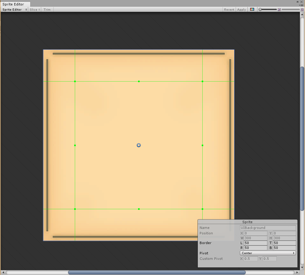
The help screen was made to look like an old newspaper of leaflet. I made the image in Photoshop, by simply having the beige background and adding in 4 brown bars with a shadow on each. 

In Unity though, I was going to be using this for many things, like the help screen, lose screen and win screen. And they were going to be different sizes.

To compensate for that, in the Sprite Editor, you can modify the border. What this does, is that you can make it so when you resize the image, some parts remain the same size. So you don't have to make seperate sprites for each sized background you want.

fdsfdsfsd.PNG

Above is a gif showing of the interactivity of the UI. I wanted the buttons to feel good and have the player know full well when they're hovering or pressing one. 

When the mouse cursor enters a button, it calls a function which sends its game object over with it. The scale is then multiplied by 1.1x and divided by 1.1 when the cursor exits the button. Unity's default button component also has a colour change when hovering, pressing, releasing, etc. It can be seen when the button is being hovered, the colour turns more white and when it's pressed it turns darker. 

Another element is the help screen. Originally I had it so that when you pressed the "Help" button, the screen just appeared, yet having an animation for it slide upwards makes a big difference in how you feel. It feels like it could be something in the game world, rather than just an abstract visual element. It feels like the player themself could be lifting the card up to their face to read it.

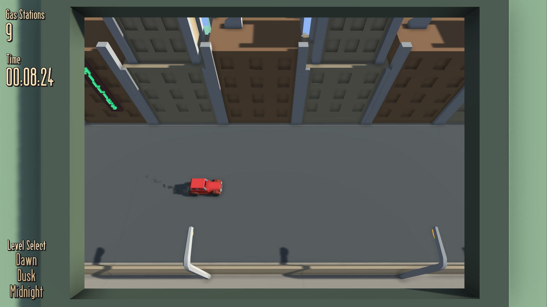
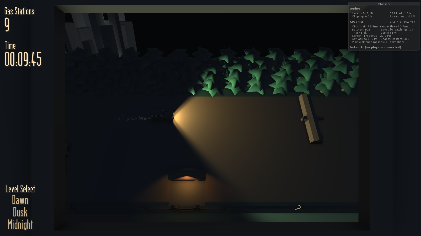
Now for the in-game UI elements. The level select buttons work the same as the ones on the menu, so not much different there. At the top left of the screen though, there is the gas stations remaining and the time elapsed so far in the game. 

To the left is what you see when you go through a gas station. Originally though, the number just changed with nothing special added on top. Through playtesting though, and especially with people who haven't played Barnstorming before, they didn't know if they were doing the right thing when going through a gas station.

At the time, there was only a small little flag pop up on the gas station, but in some parts of the game that isn't visible.


So for UI feedback, I made the text "pop". It's a simple animation, affecting the scale, position and colour of the text. This makes it so the player's eye sees this when they go through a gas station. Did they do something right? The text popped out as green so probably!

fdsafds.PNG

When the player goes through all the barns and arrives at the farmhouse, they are presented with the win screen. It tells you what you have done, the time it took you and your highscore for that level. You can also click the menu button to go back to the menu.

It's also easy for the player to see if they have beaten their highscore or not. The "Time Taken" text will be green if they have, or red if they haven't. Making it the same colour as the highscore text would just make the player count the numbers to determine that. Having the game quickly display whether or not they've beaten their highscore allows them to quickly hop back in and try again.

Also, with this image you can see the background at a different size. There is also a brown border around the image. This was made not in Photoshop, but in Unity using the Outline component. 

Dev Diary - Barnstorming Remake: Visual Features

In Barnstorming there are 4 different levels, each having their own difficulty level. In my version of Barnstorming, there are 3 levels, with not really any difficulty change, just different number of gas stations you need to go through and the time of day.

The first level is at Dawn, the sun is rising and in front of the player. The second level is Dusk, where the sun is rising and behind the player. Finally, the third level is Midnight, where it is dark and the only way for the player to see is by using their headlights.

The different elements that change for the visual look are:

  • Directional Light.
  • Player Headlights.
  • Gas Station Lights.
  • Fog.
  • Camera Background Colour.
  • Ambient Colour.

In script, when a level changes, the game checks which level is it changing to, then it changes the corresponding elements to create the look.

Dawn

  • The directional light rotates to face the front of the car.
  • The player headlights are disabled.
  • Gas station lights are disabled.
  • Fog (greeny colour) is enabled.
  • The camera background colour is set to a light blue.
  • Ambient colour is set to a de-saturated light blue.

Dusk

  • The directional light rotates to face the back of the car.
  • Same settings as above.

Midnight

  • The directional light rotates to face under the game space.
  • The player headlights are enabled.
  • Gas station lights are enabled.
  • Fog is disabled.
  • The camera background colour is set to black.
  • Ambient colour is set to a very dark blue.

Above is what it looks like at Midnight if the fog isn't disabled. Since the fog is green the buildings stand out. 

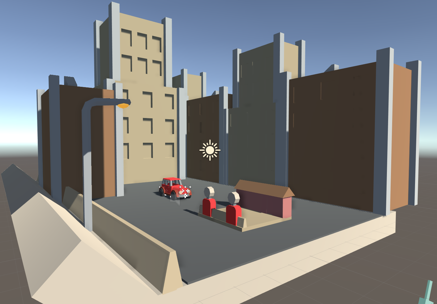
Now this is it without the fog. It looks like night time, yet with the buildings still appearing bright, as if the lights are on in them. The reason why the buildings are so bright compared to all the other objects, is because the directional light is rotated underneath the game tiles. Since the buildings are low down and in the open, the light can get to them.

Here's another example which isn't in the game. The directional light has been turned off and the buildings at the back are very dark. I thought about having this feature, yet in the end, the buildings lit up was still more visually appealing.

gfdsgr.PNG

For the car, the 2 headlights each have their own spotlights. Also if you look closely, you can see that the actual headlight objects are more visible than the rest of the car. This is because they have emission enabled on their material. They emit a bit of light so that it looks like the light is coming out of the objects and illuminating the casing.

The same goes for the "Phillies" sign. The material has a green emission on it, so it looks like the letters are emitting light. Although the light emitted from materials don't interact with the world or create shadows.

GIF.gif
ggg444.gif

There are also a couple of small animations added to add some "juice" or feel to the game. Colliding with a solid obstical plays the collide animation which just adds a little something, making it seem like the player actually hit an object, rather than just bounced backwards from hitting it.

The flag popping up on the gas station though, is more for visual feedback. In the final game, going through a gas station: pops up the flag, plays a sound effect and has the gas station UI "pop". 

Dev Diary - Week 4: Playing Up Ship Creek

This week in class, we were introduced to the Studio 1 made game: Up Ship Creek. I was fortunate enough to be one of the three people to play the game and I really enjoyed it. The first thing you notice, are the large amount of mechanics. The 6 on-board card holders, characters, items and systems needed to be done each turn creates a certain experience.

One which makes the player feel as if they are on a spaceship in a hectic situation. Hazard zones, rolling on luck (in a way) and being under time or turn pressure adds to the experience. Every decision matters and the constraints (time or turns) impact that. If the team is under a time constraint, then it will be a mad rush normally. We got into gear and headed straight for the objective, not picking up items and generally not planning ahead for where we will be for the next crisis. Whereas, when there was just a turn constraint, taking out time was much more common and we went over multiple different plans of attack before committing. This relates back to how a situation like this would really go down. If there was a real life time constraint, then there would be a mad rush to get whatever is causing the countdown to stop. Whereas if time is not a problem, then the situation can be approached from a more thought about point of view, focusing both on what needs to be done now and how we can make it easier for ourselves in the future.

A system in the game that confused me a bit while playing, but is clear now, is the rolling of dice. If you land in a hazard zone, then you are rolling against the board for the lowest number. Whereas if you are attempting to "complete an objective" (beating a condition card), then you are rolling against the board for the highest number. This is because hazard zones are more generous to weaker players, where as the condition card roll is more generous to players with the required resource. If we flipped the hazard room around and made it so that rolling the highest number grants you victory, then they wouldn't really feel like a hazard. You send the player with the most health or the most stats off to do the dirty work, because if they get affected somehow, it will be less of a blow to the team. It makes hazard zones less of a "why bother going there, I'm low and probably going to die", and more of a risky chance.

Another interesting thing that was told to us after playing which we didn't even think about, was our starting positions. Each story has a different starting room and the placement of the players actually matters. You want the people with the least action points closest to the exit of the room, and the people with the most, you want further back. We started totally at random, with out 3 players lined up, not in action point order. If did, then the start of the game would probably have been easier as we would have been able to move around further.

Dev Diary - Week 3: Playtesting

So today in class we were doing playtesting. I had a pretty solid build down, with a functioning game and win state. I had a few people play it and overall they enjoyed the game, they said that it was well polished, yet with everything else there were a few problems.

One thing that I knew was going to come up was the level generator. It's not fully flushed out yet, so there can be potholes that spawn in gas stations and some gas stations are impossible to get to. This was brought up in the playtesting.

Another thing was the car controller itself. At the moment I am getting input directly from the up and down arrow keys. A playtester suggested that I should instead get the vertical axis as that would allow for the W/S keys, as well as controllers. I tried it out yet as I suspected, it felt "floaty". There was a short time it took from pressing down a button to the car to move up or down at the full speed. The small speed up time didn't feel right, as the layout of the game is set up for quick tactile movement. A "floaty" controller would probably be more realistic, yet for a quick, challenging game such as Barnstorming, that isn't necessary.

On final thing that I think is pretty necessary and which is part of the project, is to convey the artists message in the game. For my one, I'm telling the message of getting out a big, lonely city and going to a comfortable country town/farmhouse.

At the moment, there's not much conveying that but for a quick sentence at the start of the game, a paragraph in the help screen and the farmhouse at the end of each level. I've thought about it and ways the message could be conveyed are:

  • Starting the player of in a city and after like 10 seconds have it transition to the country.
  • Have more and more people at the roadside or at the gas stations as the player goes through more of them.
  • Have the sound of people talking on the train increase as the player goes through gas stations.
  • Maybe, have the amount of gas stations increase, the closer the player is to ending.

For this playtest session, I didn't have a questionnaire. Next week though, I will certainly have one so that I can narrow down problems. Some questions I've been thinking about that I would like to know from playtesting are:

  • How easy was it to control the car?
  • What do you think the game was trying to convey?
  • How easy did you find it to avoid the obstacles?

That's all for now, hopefully next week's playtesting goes well.

Dev Diary - Week 2: Asset Creation Method

For my game I"m using mainly 3D assets with only a small amount of 2D ones. For the 3D assets, I've been using Maya and for the 2D ones, I've been using Photoshop. 

fdsa.PNG

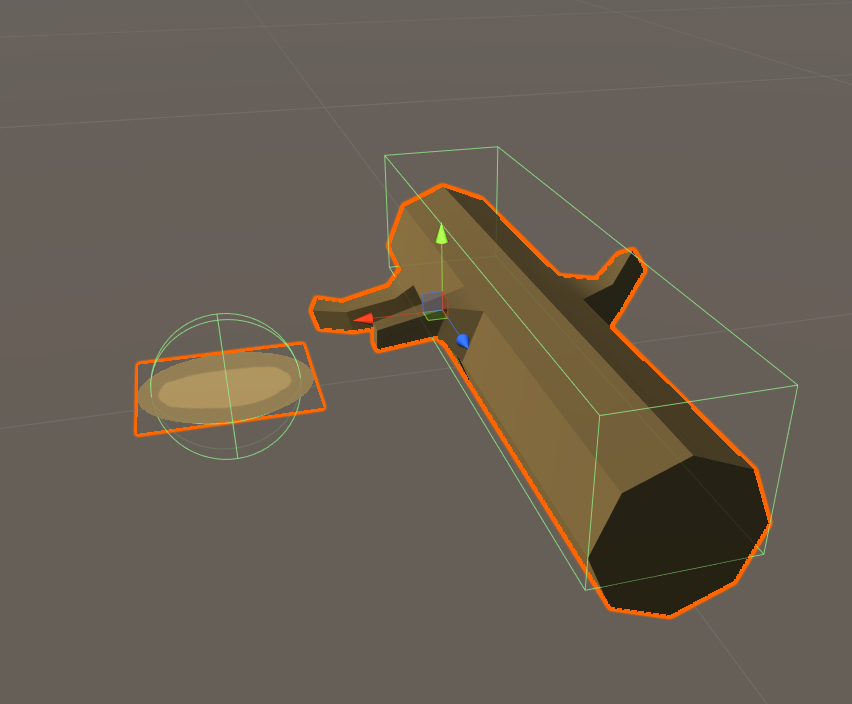
For the fallen tree asset, I started in the feature spec, just drawing a simple image. This one was to demonstrate the hit box.

Then, I go into Maya, and begin creating the model.

I first made a cylinder object, then made the curved face into 8 sides. This follows the theme of the game being low poly. Like in the "reference" image above, there are small branches poking out, so I used the edge loop tool to divide up the log. Simply extruding the faces, moving them, scaling and rotating them was then done to make the branches look natural.

Once that was done, the model was exported as a .FBX to the unity assets folder, along with the Maya file, so that I could easily edit the model in the future. Implementing it into the game is the next step of the process.

For this object, it will be either spawning on the top or bottom of the road, poking inwards. So I get the model in the scene view and make it a child of an empty game object which is in the centre of the road. Simply inverting the Z scale of the parent game object flips the model to either side of the road.

A box collider was them added and the object was tagged as "SolidObstical". All the rest is done in the code, where it is spawned and placed in the game world.

As for the green appearance of the log though, that is just a placeholder material for now.


For 2D assets, Photoshop is used. In the case of the pothole object, it is a sprite that is placed onto a quad in the game world.

In Photoshop, a white oval with some outline detail is created. The reason it is white, is because in Unity, the colour can be tinted to be whatever colour is needed. So if I was to change the road colour or if the pothole was too dark for example, I wouldn't need to go into Photoshop and change the colours around. All I need to do is move a simple slider inside of Unity.

Once the sprite is complete, it is saved as a PSD to the Unity project asset folder, ready for use.

To make it an object in the world, first a quad object is created. Then a material with the sprite as the texture is made and placed on the quad. The material is set to cutout, so that the transparent parts of the sprite are transparent. Then a simple sphere collider is added, and the object is tagged as "NonSolidObstical". 

That is it. It's pretty much a repeated process for all the 3D models and 2D sprites in the game.