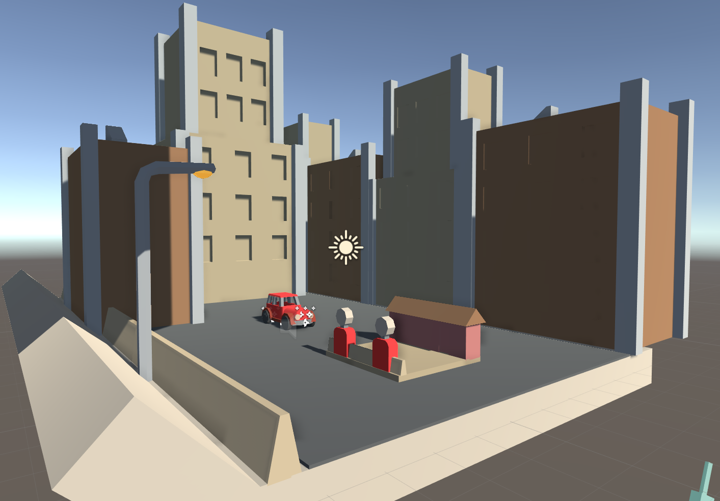
In previous builds, the player starts out in the forest and plays from there. What I wanted though, was for the message of leaving the city to be clear. So I had the first 6 tiles of the game be set in the city, introducing the player to the concept of gas stations and allowing them to move around to get a feel for the place, before they are chucked into the world.
The overall position and size of the wall colliders are the same as the forest tile. It's just the visual look that's different.
- The road is dark to look like tarmac.
- The wooden fence is replaced with a concrete barrier.
- The trees are replaced with 2 different buildings.
- And there is a lamp post.
I started off the buildings with a simple cube. It was stretched out in scale and for the building to the left, I added some edge loops and extruded a face upwards. It created a second layer.
Then I made thin pillars and placed them at the edges of the buildings. This is because looking back at images of those old fashioned buildings, their architecture is quite complex and there is a lot of detail.
Since I went with a low poly style, doing these pillars added some of that style and made them not boring to look at.
The lamp post was a bit more complex. Making it curve at a 90 degree angle was not as easy as I expected.
What I done, was I selected the top face of a cylinder and extruded it out a bit, moved it along the x axis and rotated it a bit. I done this 2 more times until it started to go horizontally, essentially making a low poly curve.
The light bulb was just a sphere object, squashed down on the y scale to make it look like an oval.
In-game, the light bulb has material which has emission enabled. This makes the light bulb appear to glow a bit. For on the Midnight level, these lights hand a spotlight attached and making the object emit a bit of light adds to the illusion that it is the source of the spotlight.
For the materials of the City Tile, it is just like every other material in the game. The metallic and smoothness values are turned right down to 0. This makes the surfaces not look shiny or reflect light at all. Having it do so would first of all, make the game slightly laggier (not really an issue), and second of all: follow the art style. Edward Hopper's paintings had colours which were pretty flat, de-saturated and not really that reflective.


