In Barnstorming there are 4 different levels, each having their own difficulty level. In my version of Barnstorming, there are 3 levels, with not really any difficulty change, just different number of gas stations you need to go through and the time of day.
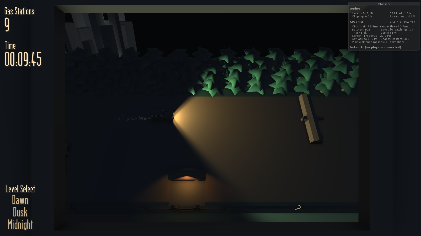
The first level is at Dawn, the sun is rising and in front of the player. The second level is Dusk, where the sun is rising and behind the player. Finally, the third level is Midnight, where it is dark and the only way for the player to see is by using their headlights.
The different elements that change for the visual look are:
- Directional Light.
- Player Headlights.
- Gas Station Lights.
- Fog.
- Camera Background Colour.
- Ambient Colour.
In script, when a level changes, the game checks which level is it changing to, then it changes the corresponding elements to create the look.
Dawn
- The directional light rotates to face the front of the car.
- The player headlights are disabled.
- Gas station lights are disabled.
- Fog (greeny colour) is enabled.
- The camera background colour is set to a light blue.
- Ambient colour is set to a de-saturated light blue.
Dusk
- The directional light rotates to face the back of the car.
- Same settings as above.
Midnight
- The directional light rotates to face under the game space.
- The player headlights are enabled.
- Gas station lights are enabled.
- Fog is disabled.
- The camera background colour is set to black.
- Ambient colour is set to a very dark blue.
Above is what it looks like at Midnight if the fog isn't disabled. Since the fog is green the buildings stand out.
Now this is it without the fog. It looks like night time, yet with the buildings still appearing bright, as if the lights are on in them. The reason why the buildings are so bright compared to all the other objects, is because the directional light is rotated underneath the game tiles. Since the buildings are low down and in the open, the light can get to them.
Here's another example which isn't in the game. The directional light has been turned off and the buildings at the back are very dark. I thought about having this feature, yet in the end, the buildings lit up was still more visually appealing.
For the car, the 2 headlights each have their own spotlights. Also if you look closely, you can see that the actual headlight objects are more visible than the rest of the car. This is because they have emission enabled on their material. They emit a bit of light so that it looks like the light is coming out of the objects and illuminating the casing.
The same goes for the "Phillies" sign. The material has a green emission on it, so it looks like the letters are emitting light. Although the light emitted from materials don't interact with the world or create shadows.
There are also a couple of small animations added to add some "juice" or feel to the game. Colliding with a solid obstical plays the collide animation which just adds a little something, making it seem like the player actually hit an object, rather than just bounced backwards from hitting it.
The flag popping up on the gas station though, is more for visual feedback. In the final game, going through a gas station: pops up the flag, plays a sound effect and has the gas station UI "pop".


