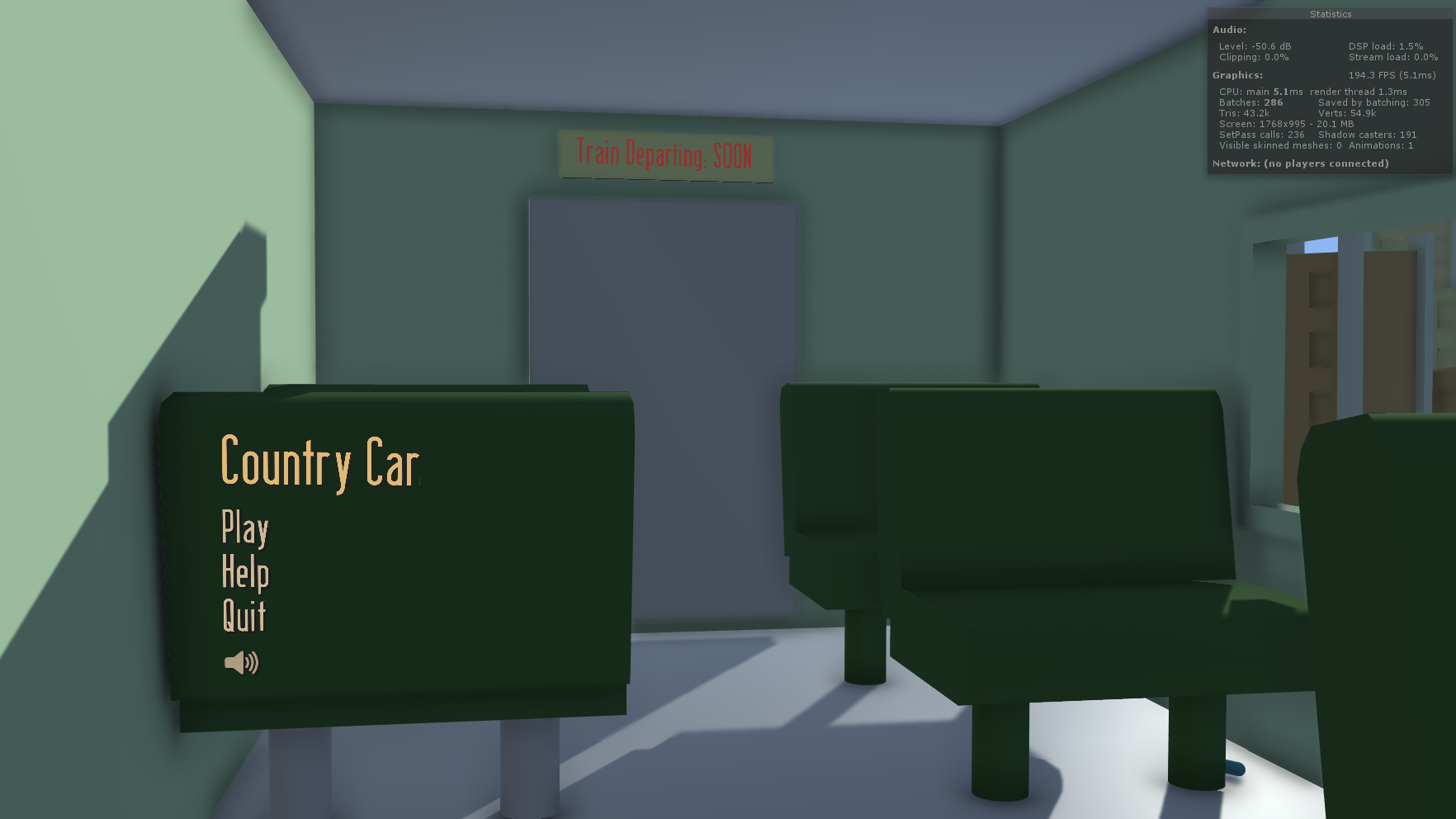
In my Barnstorming remake I went for the approach of world space UI, instead of UI that follows the face of the camera. The menu is at the back of a chair inside of the train, while the game UI is on the train windowsill.
I went with a constant theme of this old fashioned font, and a yellowy/white colour. This makes the text look like it came from those old times. The font I used is called Berlin Email. It's pretty easy to find a wide range of fonts like these. I used the website DaFont.com which is probably the largest free font website out there.
For the canvas, it was set to world space and resized so that it was at the back of the train chair. A problem with doing that though, is for me, the units were still correlating to pixel size. Before the canvas was large and at a width of 1920, now it was small and at a width of around 3. When new text was added, it was large and low resolution. To fix this, simply set the X and Y scale of the UI elements inside of the canvas to 0.01 instead of 1.
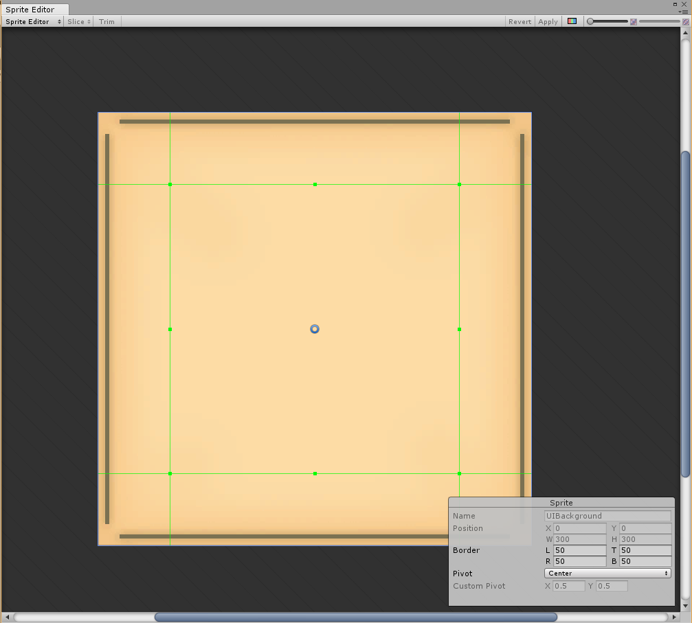
The help screen was made to look like an old newspaper of leaflet. I made the image in Photoshop, by simply having the beige background and adding in 4 brown bars with a shadow on each.
In Unity though, I was going to be using this for many things, like the help screen, lose screen and win screen. And they were going to be different sizes.
To compensate for that, in the Sprite Editor, you can modify the border. What this does, is that you can make it so when you resize the image, some parts remain the same size. So you don't have to make seperate sprites for each sized background you want.
Above is a gif showing of the interactivity of the UI. I wanted the buttons to feel good and have the player know full well when they're hovering or pressing one.
When the mouse cursor enters a button, it calls a function which sends its game object over with it. The scale is then multiplied by 1.1x and divided by 1.1 when the cursor exits the button. Unity's default button component also has a colour change when hovering, pressing, releasing, etc. It can be seen when the button is being hovered, the colour turns more white and when it's pressed it turns darker.
Another element is the help screen. Originally I had it so that when you pressed the "Help" button, the screen just appeared, yet having an animation for it slide upwards makes a big difference in how you feel. It feels like it could be something in the game world, rather than just an abstract visual element. It feels like the player themself could be lifting the card up to their face to read it.
Now for the in-game UI elements. The level select buttons work the same as the ones on the menu, so not much different there. At the top left of the screen though, there is the gas stations remaining and the time elapsed so far in the game.
To the left is what you see when you go through a gas station. Originally though, the number just changed with nothing special added on top. Through playtesting though, and especially with people who haven't played Barnstorming before, they didn't know if they were doing the right thing when going through a gas station.
At the time, there was only a small little flag pop up on the gas station, but in some parts of the game that isn't visible.
So for UI feedback, I made the text "pop". It's a simple animation, affecting the scale, position and colour of the text. This makes it so the player's eye sees this when they go through a gas station. Did they do something right? The text popped out as green so probably!
When the player goes through all the barns and arrives at the farmhouse, they are presented with the win screen. It tells you what you have done, the time it took you and your highscore for that level. You can also click the menu button to go back to the menu.
It's also easy for the player to see if they have beaten their highscore or not. The "Time Taken" text will be green if they have, or red if they haven't. Making it the same colour as the highscore text would just make the player count the numbers to determine that. Having the game quickly display whether or not they've beaten their highscore allows them to quickly hop back in and try again.
Also, with this image you can see the background at a different size. There is also a brown border around the image. This was made not in Photoshop, but in Unity using the Outline component.


