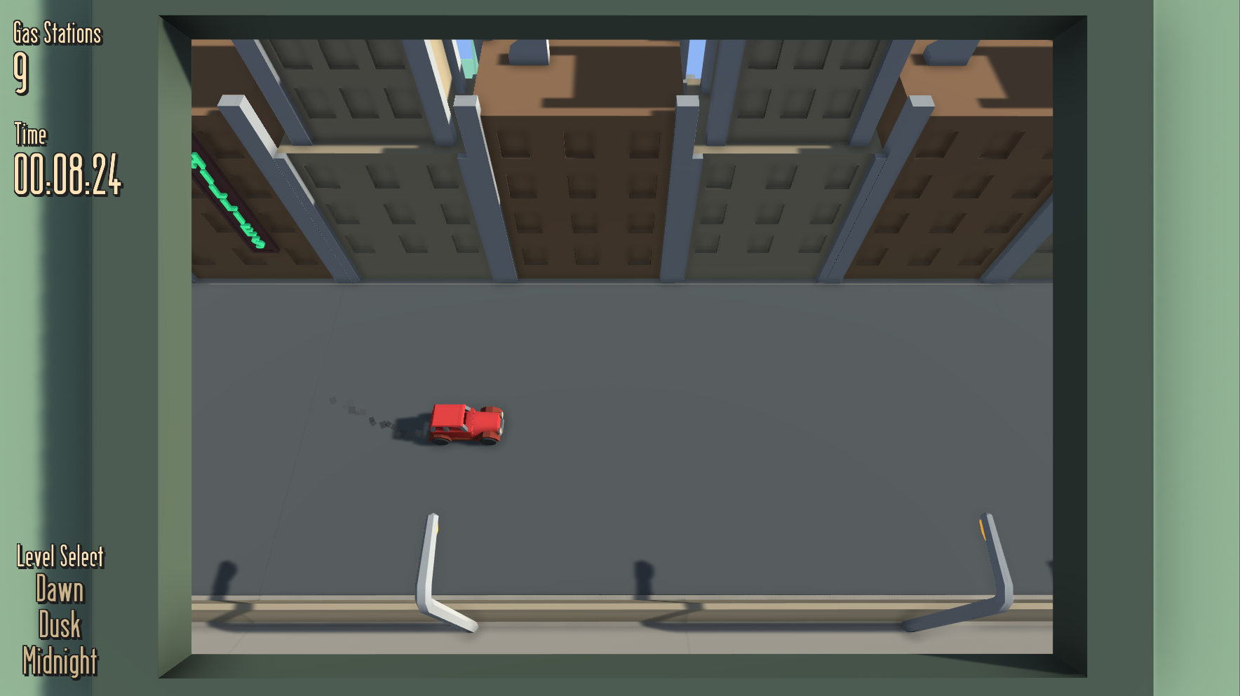
This Dev Diary will be less about the actual code or assets of the game and more about the design in terms of teaching the player how to play the game. There's not a lot of it though, yet there are 3 main systems that are taught to the player before they leave the city tiles. One of them is explicit and the other 2 are more subtle and might not be caught on by some players. These 3 systems are:
- Boosting.
- Gas Stations.
- Movement.
When the camera pans from the inside of the train to look out the window at the game space, the player is motionless, with this text in the middle of the screen. Pressing the spacebar starts the game, as well as momentarily boosting the player. They may feel it and decide to press it again later on to go faster.
Before the player can really move, they drive through a gas station, reducing one of their remaining gas stations. This is a very blatant way of teaching the player how gas stations work and the objective of the game, yet it is probably the best without having a text box on the screen.
Finally, as the player drives through the empty city for around 5 seconds, the empty road above and below them could indicate that they can move there. Pressing up to move upwards and pressing down to move downwards would be the most obvious way to do it. This could lead the players to indeed moving around, waiting for the game to truly begin.
So before the player even sees their first obstacle, they already know how gas stations work and probably have an understanding of boosting and movement. I could have had a popup screen displaying the controls and objective of the game. Yet with my method, it shows rather than tells. You can tell players all you want about how the game works, yet when they get in there for the first time, putting that theory into practice is not the same as learning it for yourself.


