Studio 2

Studio 2, Project 1 - Post Mortem

This is a post mortem for the solo Studio 2 minor project; Take it Personally. Where I designed and prototyped a game based around a real life experience.

One of the main problems with the project was probably the project plan. After around the half way mark of the project, I never really saw myself sticking to it. Whenever I completed a milestone I would tick it off as if it was a checklist and not a strict deadline. This was probably due to the fact that the project plan I done was a simple one. The layout just had the due date, task and location of completion. There was no complexity in the plan which made the milestones seem almost "in the air". No estimated time to complete, none of the specifics a part from the due date. Also another factor, is probably because it seemed kinda unnecessary. Since this is a small project and I was working on it by myself, having a full project plan didn't seem that important. If it was a team environment with at least one more person on a larger project then sure, a project plan would be necessary. It just seemed that for something this small, I was more concentrated on the project, than meeting up with the plan. A way to fix this would of course be to make it more detailed. More specifics on how long a task'll to take to complete, how will that improve/affect the project, what are the outcomes, what's the scheduled time for work? All the specifics which will make each task seem more grounded and written in stone, rather than floating around and not a necessity to complete on the assigned time.

Testing was something that I wish I done more of. In my project plan, I tasked up testing to begin on Monday of week 4. We didn't get around to it until Wednesday of week 5. Although I did do some form of testing between the 2 weeks with friends, yet taking down their complaints was just stored in my head and changed at the time. I didn't record them to see what was happening on screen, and questions asked weren't designed in a way to fix a specific problem. Then came around the official testing. We had the first hour of Wednesday, week 4 to test our prototypes. I had around 5 people test mine and in the end, came out with some good data. Improvements were made, yet they didn't really seem to change the game that much. Ideally, more testing sessions would be the way to go. I believe that me leaving it late to test, halted progress that could have been made on the design of the game. Fixing this would involve having regular testing sessions. Maybe after the prototype is ready to be played, have a testing session twice a week. This will give me enough time to make changes to the design, as well as the questionnaire to focus it on a more important part of the design. Improving the project plan would also make these testing sessions more important and a date set, rather than a suggestion.

Something that went pretty good, was the prototype. The main goal of the project was to design a game and create a rough prototype. I ended up making something that could be seen more as a flushed out product than a prototype. This was because I spent quite a lot of time early on doing the design document. This then gave me quite a bit of time to create the prototype, which I did do. I had a prototype, yet with time remaining I just kept on adding in details and other things. Coloured materials, better lighting, music, sound effects, etc. Since Unity is a program that i'm familiar with, adding these things in wasn't a problem and I believe it improved the impression of people when testing. Having a more flushed out product for a testing session, provided the tester with a better understanding of the intended experience, and focused their feelings more on what you wanted them to feel. For the future if I want to do something like this again, working hard on the GDD early is a big must. Then an art bible, which I done early on cemented the visual look that I was going for. Giving yourself enough time to make a working prototype first, then adding more features/juice if the time allows is how I would go again with it.

Gatho at 9:00 - Dev Diary #3

This dev diary will cover week 3 and 4. The prototype is pretty much complete, along with the documentation. Expanding upon the idea of trying to pressure the player and make them rush, I've added in a few new things.

In the friend's house scene, I added in some text: "Your friends can't hear you! Beep your horn!" This text pops in and out to emphasise it. This first of all, draws the player's attention to provide context on what's going on. And secondly, it encourages fast behaviour. The quick movement of the text makes it so the player feels like they need to go fast.

Capture.PNG

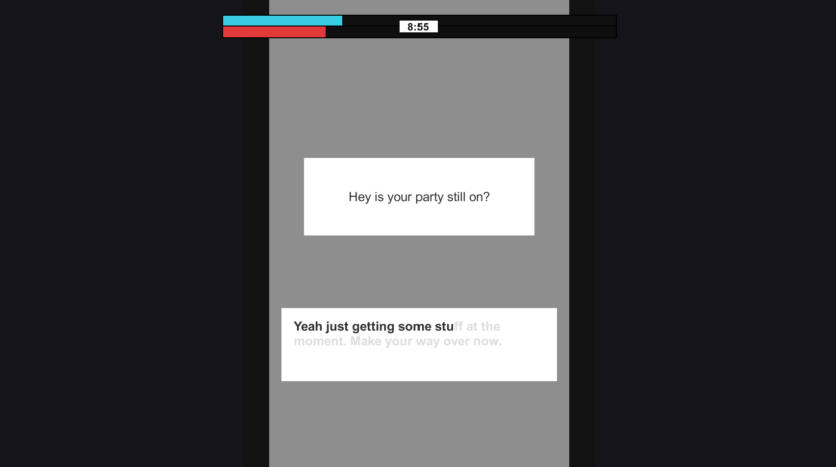
The same can also be said for the messaging scene. The same popping text can be found on the left hand side, yet along with something else. When the scene is loaded, the camera starts to zoom into the phone and rotate clockwise. This adds more movement into the scene, creating the feeling of going forward and not stopping (how the player should behave in the game). Because having a static screen for the messaging scene just didn't feel right. It felt out of place with the others where movement was occuring at all times.

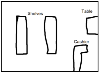
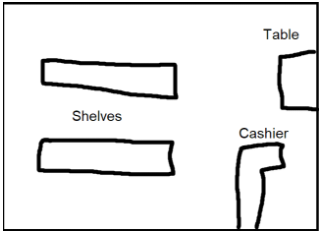
One of the largest changes in terms of documentation and the actual prototype from previous weeks, was the shop scene. I playtested the game a bit with friends and found that the shop scene was the most confusing. That is kind of intended, as you don't want the player to just fly through the scene, but it just seemed a bit too confusing. So the original shop layout was changed from the vertical shelves to the horizontal shelves.

Capture.PNG

I believe this change is quite important. Before when you loaded into the scene, only 1 shelf was visible. Where as now, all 4 shelves are visible. This prevents players wondering where an item is, only to find out that there's a shelf at the back of the store. I also added in categories on the shelves. They just give a basic word description of what's on each side of a shelf so that players can ground themselves more and understand what's going on.

Gatho at 9:00 - Dev Diary #2


It's week 2 since the project began, and week 3 since uni started up again. Most of the documentation for the game has been completed, with an art bible and asset list still in the makes. Speaking of an art bible, i've been spending some time flushing out the visual look of the game. It will be 3D, low poly and set at night.

Here's an example image from the art bible, displaying the visual look of the shop scene. Dark, small, the sort of atmosphere you only visit for a short period of time. 

The images below show off the intended look for the driving scene. Dark roads, lit by street lights with no people around.

5.PNG
 
2.PNG

A prototype has also been started on. This will just feature the base mechanics of the game and all the essential elements that are required to sell the intended experience. The more time demanding features such as models, sound effects and complex lighting will not be made for the prototype for time sake. Although later on I do intend to return to this project and flesh it out into a finished product.

The above scene you see is of course the driving scene. You have to tap differing keys on the keyboard in time to make the car go faster, com

3.PNG

Also in the past week, I added a new scene to the game. This was done to make the existing actions seem less repetitive, and push the intended experience further. The point of failure in the game for the player, is disappointing their friends. So having this scene where the player needs to frantically reply to a message adds to that and instils the sense of fear and pressure to not fail. Like the other tasks in the game, this one requires speed, by having the player spam the keyboard to fill out the message.

Gatho at 9:00 - Dev Diary #1

Our first project in studio 2, is to design a game around an experience we've had in our life. A memorable one for me, is rushing to get prepared if i'm having friends over or going to theirs. That feeling of being pressured for time and quickly scrambling to accomplish a thing, is something i'd like to replicate in a game.

So, the basis of the game, is that you are hosting a small party at your house with friends, yet you're unprepared. They all arrive at 9pm and you still need to pick stuff up from the shop and give those friends of yours a lift since they don't have a car. The game has you going through a number of different "scenes" or states. Where the player has to do certain tasks in order to progress to the next one.

These layered tasks, ticking of the clock and general atmosphere will hopefully make the player feel pressured, rushed and anxious. Because if they fail, their friends will be disappointed, as this gatho was organised weeks ago.

So what sort of things will the player be doing to create these outcomes?

  • First, there are 3 different states currently. The driving state, shop state, and friends state. Each will feature different controls and objective that needs to be completed. The better the player is at each state, will decrease their time in it, in turn: finishing the game faster, which is the goal.
  • The driving state, is what connects all the other states together. When the player needs to travel between locations, they will see on-screen the car moving along horizontally. To increase the speed of the car, there is a skill-check at the bottom. This will require the player to time tapping a certain key on the keyboard to get a speed boost.
  • The shop state, has the player controlling a first person controller. They need to find certain items from around the store based on a shopping list in hand. The similarity of many products and shelving positions will hopefully make the player feel pressured and hopefully have them running around the store.
  • The friends house state, has the player looking out of their car window at a friends house. They need to spam the space key as fast as they can, which will decrease the time that their friend has to come outside. This emulates the experience of tapping your finger when anxious/rushed for time, increasing the player's heart rate.

In terms of other features which will encourage the intended experience, those are:

  • Background music which is fast. A ticking clock can also be heard. Sort of like music you would have in a chase scene, but not as "actiony".
  • The time remaining to 9pm on-screen. This will give the player a good understanding of how long they have left, so they know if they need to hurry along faster or not. Now, it's either that option or another one i've been thinking about. And that is having the player need to hold down a button to bring up the time on their phone. This could emulate the feeling of looking down and seeing the time when you're late, with the moment of dread just before hand in not wanting to see how bad it is.
  • The general transition between the states will be instant. For example in the driving state, when the car reaches the edge of the screen, the next state will instantly appear. This adds to the urgency. It can be seen in movies, where characters in a rush are cutting from one place to another instantly.