Hook is the Hook

Hook is the Hook, is my university final project which I worked on with a fellow student. The player is a grappling gladiator. They defeat enemies in unique and stylish ways, using their grappling hook, traps and other objects around the level.

Developed: June 2018 - December 2018

My Role: Systems design, programming, UI

Type: University Project (team of 2)


DESIGN DECISIONS AND PROCESSES

This project went through quite a bit of iteration and pivoting throughout its development. From the start though when we latched onto this idea, we knew that the central mechanic and essence of the game was going to be the grappling hook.

Everything had to support and encourage that mechanic in the game as that was the player’s means of defeating enemies and in some cases transport. Creating a systematic world for the player to use this tool was the goal. Various different traps, world objects, layouts of levels, etc. All on their own done nothing. Yet when mixed with each other and interacted with by the player, opened up new and different possibilities of gameplay.

The tagline of the game is about killing enemies in unique and stylish ways. So finding new ways to do so in the game, is important for the player’s progression.

More to come…


Hook is the Hook - Dev Blog #1

What is this? Well Hook is the Hook, is the name of my final project for university. The team consists of me and another fellow game designer. At the moment, the project is halfway through development... well kinda. For uni, it's spread along the last two trimesters. Trimester one, is the development phase. Where we design, prototype and test the game to sort of flush out and get a greater understanding of what it is we're making. Then trimester two, is the production phase. This is where we start from scratch with what we now know, and well... create the game.

As of writing this first dev blog, I am in my first week of holidays, just finishing up on the development phase, and preparing for the production of the final game.

hookisthehook.PNG

Okay... but what is the game? Our elevator pitch is this:

Hook is the Hook, is a sandbox arena brawler, where you use your grappling hook to take out enemies in stylish and unique ways for the audience.

Set in an alternate-history gladiator setting, you are thrown into various different arenas, with only your grappling hook (reasons why and story are still in the works). There will be waves of enemies and it's up to you to kill those enemies. You can grapple them, throw them into traps, throw objects like crates or rocks at them, etc. Yet your focus should be on the audience's excitement. You are there to impress a crowd. So when killing the enemies, you need to do so in both stylish and unique ways. If you grab an enemy mid air and throw them down into a spike pit, that's pretty cool. Yet if you keep doing the same thing with every enemy, then the crowd's gonna get kinda bored.

grapple2.gif

Before I go on, I need to explain that this blog is going to be mainly focused on what the game is. If you already know about the game, then this stuff isn't really going to be new.

The core mechanic of the game, or the hook, is the player's grappling hook. Like I mentioned above, they use this to defeat their enemies. Also, they can use it to move around and even do both at the same time if they want.

Although the GIFs to the left are quite old, they do represent the mechanic well.

Now let's look at some of the traps in the game. A few of them were implemented in the prototype, yet there are still quite a number that are in the design phase.

t1.PNG

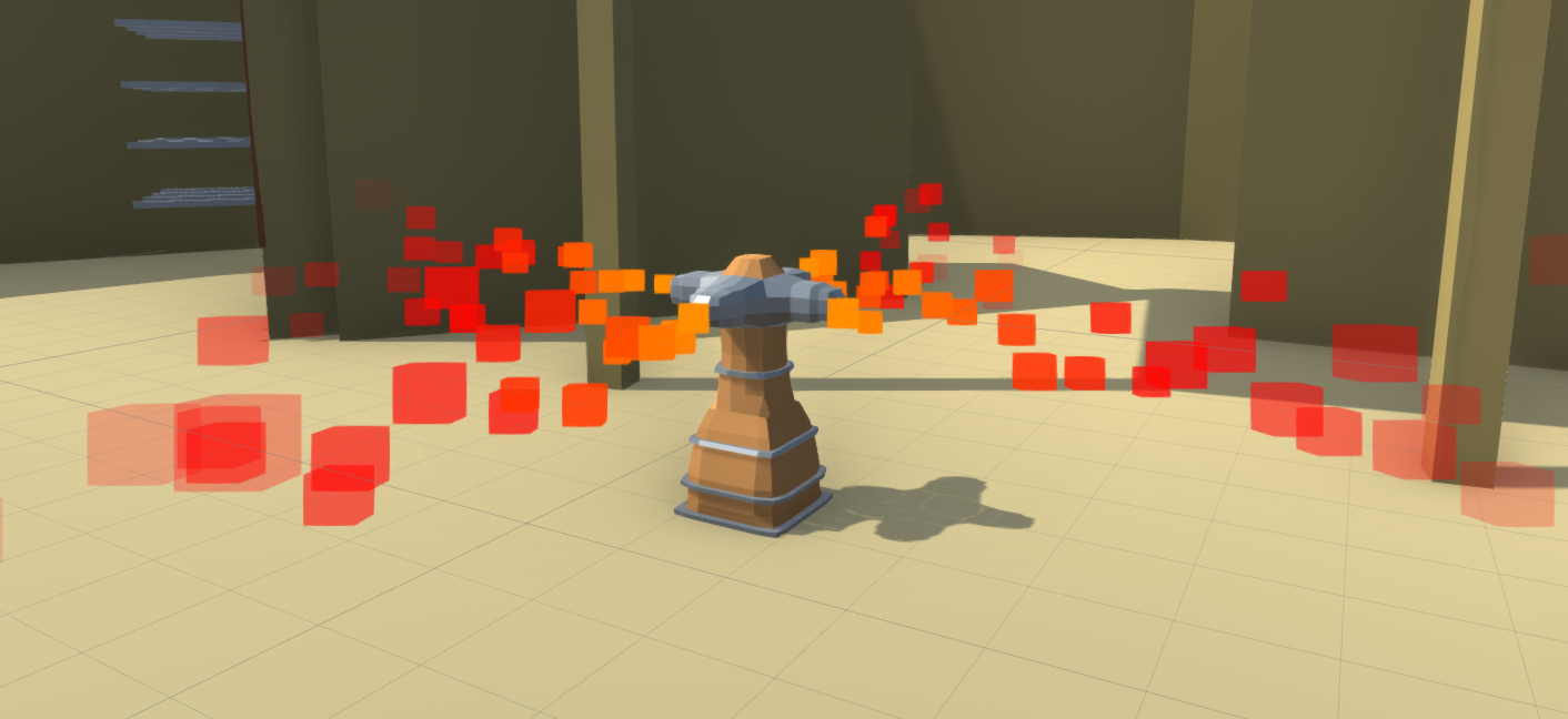
The fire trap. A four way flamethrower, which lights up both enemies and the player when they get in range.

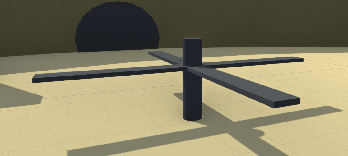
On the left is a spinning blade. This will of course chop things that touch the blades. We're still deciding if we want to implement decapitation for enemies that get cut. On the right is the lion trap. If enemies get too close to the door, it will open up and a lion will pull them in. Not sure if we're going to have it so the lion can run around and cause chaos... but that would be cool.

t5.PNG

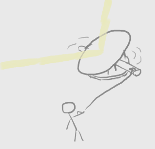
These are two traps we're planning on adding in. Something we want to focus on with a number of traps, is player interaction. Have them control the function. On the left is a large spike wall that the player can pull down with their grappling hook, squashing any enemies under it. Then on the right is a large mirror that will focus the sun into a beam and burn any enemies that get in the 5m or so range. The player will be able to grapple onto it and rotate it around.

e1.PNG

Okay, now enemies. At the moment we have four in mind. Each having their own approach to the player, means of attack and ideal ways the player can defeat them.

  • Warrior: The most basic and common enemy found in the game. This is your average fighter with a sword, who will charge towards the player in an attempt to chop them up.
  • Archer: A ranged enemy, who can shoot arrows at the player. They will try to maintain their distance.
  • Heavy: The Warrior but with a shield. The player cannot grapple the shield and if they get too close, they will be barged and pushed backwards.
  • Bomber: A ranged enemy who throws bombs. Right now in testing, this guy just seems to blow up all his friends when trying to get the player. So that will need to be tweaked.

So these enemies will be introduced over the course of the game, with each level having a unique combination of them. Oh that's right, I need to talk about the structure of levels.

At the moment, there are 10 levels. Each level has a unique set up of: platforms, traps, physics objects and enemies. New ones of each will be introduced and added in as the levels progress. For the player to pass a level, they need to meet the minimum audience excitement. I mentioned it briefly above, but you gain it by killing enemies in unique and stylish ways. If you do an interesting combo using multiple elements, that kill will reward you more audience excitement. Yet if you keep doing the same thing over and over again, you will only get around 20% of the original score. This is to deter a master strategy, and encourage exploration and experimentation.

Thanks for reading. Right now we're on holidays, so not much is going to be done. Yet when uni starts back up, I'll try and release one of these every week or so. Also, if you're interested in the development process, I've written a post mortem for the project so far.

Kings of the Arena - Dev Blog #8

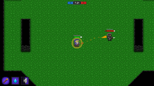
It has been exactly one whole year since I first embarked on this project. Although the game hasn't been in development for quite some time, I've decided to come back and write a dev blog since I kinda never finished it off. Last time I wrote one was September 2017 and now it's August of the next year, so what's changed? Well, not much really. I went back to uni after the last one and only worked on the game for a bit in December.

In March, I published the game on itch.io.

I had it sitting around and thought "hey, I got this game I put a lot of work into and it's pretty fun." So I published it to the world for anyone to play, and remove the need for me to upload a build to Google Drive every time I wanted to play with my friends.

Speaking of playing with my friends... a couple times this year we hopped on just for a laugh. A few bugs were found and of course they were abused to hell. Things like the Mage's shield giving a speed boost every time it was casted and the fact that the shield done nothing at all to protect the player. This prompted me to make a small update, fixing these bugs so we could play a fair game. Also one of my friends has an Apple computer, which meant I had to make a Mac build. So if any of you Apple users have wanted to play this game, now you can.

There's still only one map in the game since I haven't found a reason to make another one. The gameplay from I saw during the playtests, just seemed to consist of players running around in the open, shooting and dodging.

I've thought about doing a post mortem on the game, yet I don't really consider it a finished product. There are many things I want to add and fix, yet my focus is on other projects at the moment. I'll probably return to this thing one day and continue working on it, or maybe restart it totally like I done originally.

If this is the first dev blog you've read of this game, then I highly recommend you go check out the previous ones. They were back when I was actually developing the game and you can see both the progress and process of the game and how it came to be what it is today.

Post Mortem - Hook is the Hook (Development)

Note: This project is only half way through development. There are two phases: development and production. Development is the design and prototyping phase, while production is producing the game to launch. This post mortem is for the development half of the project.

This trimester we designed and built a prototype for Hook is the Hook. Overall, the process went well. We achieved most of our objectives and the multiple playtests helped form the game into what it is now. Yet there were aspects of the development that we lacked in, or which gave us problems. The following post mortem will go over these issues, as well as what I think we done right.

Code Structure

Going into a large project like this, structuring the code so that it is efficient, expansive and integratable is very important. Many of my projects in the past have had no pre-defined code structure, which ends up causing the code base to get confusing, un-efficient and not that expandable. This is what we were doing with the prototype. We went in, writing code on the spot for what we needed at the time. There was no predefined structure or plan for what we were going to do. Even with only around a dozen scripts and two months of development, the code started to feel a bit overwhelming. It was evident that if we continued with the process of just writing what we need as we go, then many problems will come our way. If not now, then definitely in the future.

This of course happened due to our approach. In terms of code, we had a rough idea of what we needed to complete for the prototype, yet never had it planned out. Since the game is very sandbox focused, we’re giving the player a bunch of toys that all need to interact with one another - so using events is necessary. At the time of making the prototype, I only ever added in events when the code required it. Most notably, the grappling hook script. At the moment there are seven events running the code. These were added in over the course of the trimester rather than at the beginning, causing the script to be inefficient and confusing to look at. Also with no overall codebase structure, we didn’t implement any inheritance based classes. Which in a game like this with various types of enemies, traps and other objects, is something we need.

I’m already working on part of a solution for this problem. A tech spec. Laying out all the events we will need and data classes for those events. Along with this; the classes we will be creating, how they interact with others and what they will be inheriting, etc. This is and will be in future weeks, done by writing documentation, utilising mind maps and even perhaps drawing diagrams to illustrate the overall structure and visualise it easier. In doing it this way, we will have a solid understanding of what needs to be made and can even produce estimates of time and weighted importance for different parts. It won't be us just going into an empty project, making a player controller, grapple script, etc as we need it and ignoring all future problems.

Iteration

One thing I believe we done quite well, was iterating upon our design to make it much better than it originally was. At first, we had the idea for a metroidvania-collectathon game, similar to that of Banjo-Kazooie and the like. Upon pitching it though, we found that the scope was too large and most importantly - the game had no hook. What made it different from the inspiration? Not much really, apart from some mechanical changes and the level design. This prompted us to find a new game, with a hook this time. We landed on the keywords of “grappling hook” and “action”. Bouncing ideas between the two of us, we finally came to an action based, sandbox grapple hook brawler. From what we could find, there wasn’t anything similar to it and most importantly, it had a hook - literally.

Prompting us to find this new game was of course, the search for a core mechanic. Our original idea of a metroidvania-collectathon grew from us wanting to recreate an existing game, mixed in with some other elements. This caused the game to not really have an identity of its own, and just be labelled as “Banjo-Kazooie but shit”, as evident from the first pitch. We weren’t designing a core mechanic, we were designing around a core mechanic. From there, we scrapped the idea and designed a new game. Hook is the Hook, grew from finding a core mechanic and building outwards from there. We had a mind map filled with different game mechanics and genres, connecting to bubbles detailing how they could be used. These then helped us pin down the idea of “grappling hook”. From there, we thought of how this could be implemented. Through Discord, we iterated upon it, how it can interact with the environment, enemies, other objects, etc. The core design of the game was what we worked on first, not what we wanted it to look like, or what we wanted it to be similar to. Really the only thing we compared it to in those early days, was Spiderman - and that was just the concept of swinging and moving smoothly through the air. We only started to think of a theme and structure once the idea of a grappling hook was an agreeable core mechanic between the two of us.

This way of finding a hook and building off from it is something that I will definitely be using in the future. First, creating a mind map and filling it with all different game mechanics and genres that come to mind. Different systems from other games like: gravity manipulation, deck building or reverse tower defense. These can then be combined, torn apart and compared to one another to create a mechanic that is both expandable and unique. Normally with a grappling hook mechanic in games, it’s used only for traversal. In Hook is the Hook, it’s used for both movement and combat. Really, it’s the player’s only form of interaction with the world.

Marketing

Marketing is an aspect of this trimester which we pretty much done none of. We do have a Twitter account, yet the handle is of our initial name for the game (Grapple Gladiator), not Hook is the Hook. Originally, we planned to use the Twitter account to post updates on what’s been added, changed and just interesting GIFs that we believe could build up an audience. As after all, we’re building the game around the idea of these “cool moments” to share with friends and the internet. Yet none of that happened. We also had ideas for a potential YouTube channel, to showcase video updates and trailers for the game. This too fell flat.

The primary reason why I believe the marketing failed, was due to the lack of a marketing plan. We knew what we wanted to do, yet never had the push or foundation for doing so. We created a Twitter account, yet what do we post? And when? We were working on the project and it never came to our minds to share what we were doing on there. Really, it just became a thing we ticked off as having without putting much effort to maintain. Also the fact that we were just prototyping the game and not really having a direct goal of releasing anytime soon. I remember myself always thinking “oh, we’ll start marketing next trimester when we’re doing this for real”. Yet the main purpose of the Twitter account was to in-fact show the process from nothing to release.

In both next trimester and for future projects, a marketing plan will need to be made. A layout for what accounts will be made and the purpose for them. What sort of information are we going to share? In what format? Every week? Twice a week? It will outline a specific schedule for releasing content which like a work calendar, will hopefully encourage us to do it more. We can anticipate when we’re going to be releasing a GIF of gameplay, so we have it ready for the day and can share it on all the platforms we need to. For next trimester, I intend to have the following social media platforms: a Twitter account, to share GIFs of new features and interesting things that happen in the game. A YouTube channel to post weekly or monthly dev logs which will go over changes and additions to the game. Finally, a Reddit account, which can share posts from the Twitter and YouTube accounts to various different game dev related subreddits. This is an optimistic goal, which hopefully a marketing plan will help encourage us to achieve.

Orbit Orb

Orbit Orb, is an infinite runner, reflex based mobile game. The focus on this project was monetisation and the ethics that follow as a developer. This was also a great learning experience for both implementation of ads and IAP, along with analytics and using that data to improve the game.

ddddd.png

Developed: June 2018 - August 2018

My Role: Designer, Programming, UI

Type: University Project (team of 3)

DESIGN DECISIONS AND PROCESSES

This project was primarily about monetisation. We used various different methods of generating revenue in the game, while trying to keep ethically acceptable.

Advertisements

The game was designed in a way, so that players would want to watch ads, as they would receive benefits from them. The two sources of ads are as follow:

  • Revive: When players die, they can watch an ad (once per playthrough) to revive them self and continue from where they died. With the game being an infinite runner, players would want to get as far as they can. So watching a quick ad both benefits the player and us.
  • Unlock Abilities: The game has abilities which can be activated by latching onto an orb. These can be a rocket boost, gem multiplier and other benefits. In the store the player can unlock an ability to use straight away on their next run, just by watching an ad.

In-App Purchases

Although not currently in the game, we do have the ability for players to purchase the in-game currency, with real money. This allows those players who don't want to grind for a specific cosmetic, to get it instantly. Not affecting their gameplay.

Read Post Mortem

Post Mortem - Alien Burger Maker

Overall, I believe Alien Burger Maker is a successful project. Although we didn’t entirely meet the criteria of an energetic experience, the final product is a finished – and with what time we had, a polished game. Yet that doesn’t mean the game is perfect. Both it and the process of creating it brought up a few problems that will be addressed in the post mortem.

Creating an Energetic Experience

This is not so much of an issue with the game, but an issue with the fact that we focused on this aspect far too late and far too in-frequently over the course of the project. The overall goal of the VR game was to create a short energetic experience to get people ready for their day. I believe that we accomplished this with the late changes we made, yet overall it could have been improved. Our bi-weekly interviews with Damian (CEO of Liminal, the clients for this project) gradually focused more on making it build up. Having it get more hectic, make the music tempo faster, have a big finale ending that can give the player that energetic boost. By the end of the project, we had quite a few elements that increased over the course of the game. The ingredients fell faster and more frequently, along with more customers coming to the window at a time and having more background activity. Yet it fell quite flat in other areas. The end scene was functional, yet very much not complete. There was no sound accompanying it and it felt quite sickening to watch in VR. Also we did not get around to making the music increase in tempo or change to more energetic tracks as the game went along, as we intended.

This happened because we were focusing on other aspects of the development. At the time, focusing on the energising elements felt more like polish to us. We had a large amount of bugs and refining of features to do, causing our focus to be more on the technical side than the design side. Although we did get around to adding in more “energetic” features and changes, this was later on in the project once the existing problems were fixed or at least held together. There were two main times in the project that we focused on the experience. A chunk at the start, before we had many technical problems, and a chunk at the end, when the problems were mostly fixed. The rising tempo in music is something that I believe would have been a great help in creating an energetic experience. Yet the process of doing something like that was foreign to us, and without an audio student, this feature was just left alone. We did have the idea of changing the track to something even more energetic every 1/3 of the game, yet that was just days before the release and we were still focusing on (what we thought were) more important matters.

So how could this problem be reduced? Well basically, just working on the experience as you go. We focused on it in chunks and put the technical problems ahead of the experience always. A much better solution would be to try and incorporate both at the same time. If there is a technical problem blocking you from working on a certain part of the experience, find another one that’s open. For example, if the ingredient tube is playing up, you can’t really test out the increasing speed and that. Yet the music would be open to work on. As a team of three, this could have even been less of a problem. Having one or two people work on the technical issues and another work solely on the experience. We all dipped our toes in working on the experience, yet really one person should have had the focus. They could have then attended most of their time in fine tuning and testing the game to make it even more energetic than it already was.

Good Work Ethic

Quite a contrary to what I talked about above, but let’s continue. I believe that the work ethic both my team and I had during the project was quite good. During class, we always knew what we had to do and never really slacked or procrastinated against working. Even when we had game breaking bugs and roadblocks, they were adamantly worked on until they were solved. The overall process of prototype, to placeholder to final build was a smooth and rewarding process.

This was probably due to the fact that we had a direct goal. The game as it is, is quite simple. Customer comes to the window, they give you order, you make the burger and give it to them. This game loop, although simple, can provide variety and interest for a player as there are many different approaches they can take. There was never really anything more complex apart from that. We had to create the systems, add a bit of progression to make the game end up somewhere and it was pretty much complete. This small, yet expansive goal, allowed us to work quickly to a fully functional game, then just move upwards from there. In many other previous projects, where we needed to add in levels, different characters, and other branches of design, the functional product is normally only finished much later on into the project. Here, we had a short goal, achieved it, then just refined it and added in polish. The inclusion of also having a set date for beta, made this process much more structured and streamlined. We knew we had to have all of our features done by a certain date, allowing us to just improve the game from there on. As working on a functional game is much more enjoyable and rewarding than working on one that barely works or is destined to fail.

In the future when attempting a game, the following things should be applied: A direct goal. Now not every game is going to be as basic in mechanics as Alien Burger Maker, yet working towards an achievable goal is. A game is not necessarily only functional (or ready to play) if all the systems are added in to some extent. As long as the core experience is achievable then i’d say it’s good for now. Removing or temporarily putting on hold aspects of a game that don’t directly affect the experience or core game loop would help to reveal the goal. Also having a set date for a beta would be good. This being the first project we’ve had with such a thing, it really helped us to scope the project and allow us to work smoothly towards the end goal. Then having those few weeks of just polish and bug fixing further made the process of working easier. We have a functional game – we can play it. Now, we’re just making it better than it already is. Really, it can only get better from there.

Frame Rate

By far the largest issue with the game both during development and now, is the frame rate. For a VR experience the frame rate should never really dip below 60 fps. Ours on the other never really reaches or goes above 60 fps. Early on in the project, the fps was fine. It only started to dip around half way through development, and we didn’t and still don’t really know why.

We tried many things to fix the problem. The code was optimised to remove any unnecessary loops or GetComponents that would slow down the game. We changed out the original voxel placeholder models (which were quite high in polys) to newer and smaller final ones. We tried disabling various different objects, then running the game to see if the fps went up. Overall, it didn’t really work. The best we got was a few fps increase, yet as a whole the problem still persisted. When I said we tried a whole bunch of different solutions, it wasn’t enough. We never went back to a previous build where there was no lag to see what was different. We just tried to use what we had at that current time to fix the issue.

If ever we were to make a VR game again, we’d approach it differently. Going into it, we were using the same approach as if we were making a desktop game. Optimisation was not a focus at all at the start and even quite a way through development, it was ignored. From the beginning we should have planned for something like this. Pooling objects that frequently spawn is one of them. The ingredient tube creates an object every 0.3 seconds, each with their own model, physics and script. If we pooled these objects when the game started, I believe that the fps problem would have been reduced, as that was a hunch we had, yet we never done anything about it. Also focusing on optimising the 3D models. Removing any unnecessary polys and scaling the models so that if they’re small or far way, they’re not as complex. Similar to the point of creating the energetic experience at the start of the post mortem; working on it throughout the project, rather than when it’s all of a sudden necessary is what should be done.

Post Mortem - Orbit Orb

Focusing on the aspects of monetisation and ethical use of monetisation, I believe that Orbit Orb succeeded in what it tried to achieve. The road to it though, was not all smooth, as will be explained about in the following post mortem.

Nailing Down the Idea

When assigned the task of making a mobile game that can utilise monetisation methods, it took us quite some time to finalise our idea. There were two games we pitched and designed before landing on Orbit Orb. The first was a tower defence game, which through pitching and further thought was deemed to large of a game to make. The amount of assets we would have needed to created, along with all the various interactions and levels, made us scrap that idea. After that, we pitched a gravity puzzle game. It had a simple layout, core mechanic and was ease to expand upon with new elements and levels. Yet it never really stuck. It had been done before and the idea just seemed – meh. Finally, we pitched Orbit Orb. A game with a unique mechanic of jumping between orbs, that we came up with on the day of pitching.

So why did we jump between all these different ideas? Because the hook was either uninteresting or there was really none at all. The tower defence game had no hook. We tried to come up with one after the initial pitch, yet it fell flat as we were trying to implement it into an already existing game, rather than building the game around the hook. With the gravity puzzle game, it lacked in originality. We thought the idea wasn’t used that much, yet upon researching, we found that it was indeed quite common. With that knowledge, we tried to make it more original, by adding in different elements that the player can interact with, yet none of that helped. The core mechanic stayed the same and we didn’t know how to change it. Only Orbit Orb had a unique hook. Jumping between orbs in an endless runner seemed original and making it reflex based allowed us to appeal to to a more specific market than the other games would.

So next time we make a game, the hook needs to be the core focus at the beginning. Orbit Orb, was only successful because we built of the idea that we talked about in class. We didn’t start with the theme, genre, or other mechanics – just the hook. What will the player be doing the most? What will you say to get people to play your game? This way of building up a game from the hook can be seen in one of my other projects. Our initial game was one we didn’t build up from a core mechanic, but from an existing genre with our ideas spliced into it. It didn’t work, and only when we created a hook and bounced off from it, a new, unique and fun game came into existence. So how can you come up with a hook? Well making a mind map is a great start. Listing out different genres, game elements and player interactions. These can be mixed together to create a unique game mechanic. Also doing research on games similar to the ones you’re making is good. We found even with the unique mechanic of Orbit Orb, there were similar games such as Sling Kong. So we tweaked the design to be different, in the end further defining the game as its own.

Scoping

One thing i’m glad we kept consistent, was the scoping. When we went though all the different designs and pitches of games, we landed on Orbit Orb around a month into the trimester. At that point, I just wanted to have a basic game that we can apply monetisation to, as we were quite behind. With this relatively small scope, it allowed us to finish the game right on time, with most of the monetisation features implemented. From there, it was just bug fixing and small tweaks both mechanically and visually, to further enhance the game.

This was done by having a relatively simple design goal: to make an infinite runner with a fun, yet simple mechanic. If we decided to go with one of the two previous game ideas, we would most certainly not have made the release date, or have made it with a butchered version of the game, vastly different or inferior to the original design. With Orbit Orb, we just needed to focus mainly on the core player mechanic and procedural generation to have the game fully functional. If we were making a tower defence game, we would need to make the towers, enemies, progression, levels, etc. We finished the core game quite early on, with a fairly playable version ready for the first playtest. All it included, was the ability for the player to jump between orbs and a very basic procedural generation. It was able to portray the game’s intended experience and feel very early on, with this most likely not being the case for our previous ideas.

Scoping is a very important part of game development and I will very much utilise the methods we used on this project for future ones. For a simple game like this, finding a core mechanic and sticking to it is the best option. With that, you’ll be able to prototype very early on and be able to playtest even with a primitive version of the game. Doing so with a more complex game, such as a tower defence, is much harder. With something like that, the game loop is held together by a lot of different mechanics and systems. Yet that doesn’t mean you can’t simplify it early on. Finding what makes your game interesting and what the core experience is can help with scoping your game and being able to prototype early and finish early. What mechanics do you need? What ones don’t you need? For an early playtest, just focusing on the mechanics that are necessary to be able to play the game at a very basic level should be your focus. If this can’t be done, then maybe scoping down your game is the best option. On one hand, scoping down can decrease the complexity of a game, on the other it can enhance the experience and potentially reveal a core mechanic that was otherwise unknown of not yet in existence.

Progression

In an infinite runner type game like Orbit Orb, progression is very important. It can increase interest for players and add more of a challenge so they come back for more to see how far they can get. In our game, this was something that was not a large focus, and only became one much later into development. We had ideas on how we wanted the game to progress, yet the end product was a much less subtle and basic version of that. About 2/3 of the way through development, we came up with the idea of splitting the game into chunks. About 300m each in length. These chunks would each change different aspects of generating orbs. How far they can be apart from each other, their layouts, frequency, etc. This would be a sudden change that the player could easily identify. Yet the final product was not this. It was much more simplified and not apparent to the player when they entered a new chunk.

This was due to the way we approached development. With the progression system early on, it was very lightly documented. Just the basics of how far orbs should spawn from each other and the technical side of things. With that, we could easily implement the basic progression system. Yet when we came up with the new one, it didn’t get documented at all. At that point, the game was mostly complete, so referring to the documentation felt unnecessary to us. Also on top of that, I don’t think we had a solid understanding on what the progression was. We talked about it, yet I think we each had our own idea of how it would be set up. This is a by product of not documenting it. No one had a 100% understanding of what was gong to be made, so it ended up being scrambled together as a sort of blob that kind of resembles the initial idea.

Solving this problem, would be done through documenting the system. Someone came up with it, yet someone else had to implement it. The lack of diagrams and detailed explanation caused the confusion and lack of enthusiasm to work on the system. Adding on to the fact that this is quite a complex system, that cannot easily be explained to someone through conversation. So to fix this, when the idea comes into mind, write it down. This can be done on paper by drawing pictures, labelling them, or starting to write down dot points. Then transferring it into the game design document, properly explaining all the aspects of the system and how to implement it. This would remove the confusion behind what does what and what’s involved.

Alien Burger Maker

You are a chef in an alien burger restaurant. Make odd and unique burgers for the hungry aliens before the destruction of their planet.

Developed: June 2018 - August 2018

My Role: Project Lead, Designer, Programmer

Type: University Project (team of 3)

DESIGN DECISIONS AND PROCESSES

Alien Burger Maker, was a game we made for Liminal VR. They make short experiences to create certain emotions. For this project, we were told to make an energising experience. Something that people can play to make them feel pumped and ready for their day.

This was done through a number of different ways.

Gameplay

  • With the ingredients falling constantly, the player is always grabbing them and serving burgers to the aliens.
  • The addition of needing to squirt sauce onto burgers and add the top bun, encourages movement of the arm.

Progression

  • The game has more and more customers come to the window at once as the game continues on, increasing the speed and multitasking that the player has to do.
  • Ingredients spawn and fall faster as the game progresses, emphasising the speed.
  • At the end, the game finishes off with a grand finale. The restaurant launches into the air, drills through the planet and then watches it as it explodes.

Theme

  • The game has a wacky/abstract/hyper-realistic theme to it. This takes the player out of the world they know and puts them into one with different rules and unknown expectations.
  • It's a very colourful game. With the aliens, ingredients, environment, etc. This is a very saturated and fun game to look at.

Read Post Mortem


Nesting Instinct

During an ongoing storm, you (a flying squirrel) and your babies have taken shelter in the nest. Although as the storm continues, your babies grow hungry. In order to feed them you must go outside into the storm.

Developed: April 2018 - May 2018

My Role: Project Lead, Designer

Type: University Project (team of 9)

DESIGN DECISIONS AND PROCESSES

Nesting Instinct, was a university group project based around the idea of home. The game presents home as a place of safety, yet requiring the player to leave their comfort zone in order to feed their flying-squirrel babies.

There are 2 distinct areas in the game. The nest and the outside. The nest is calm and warm, while outside is dark, cold and daunting. There were various different ways these 2 feelings were accomplished.

Nest

  • Soft, orange colours to emphasise that this is a warm place.
  • No ambient storm noises, just calm guitar music.

Outside

  • No music, just ambient wind, rain and thunder noises.
  • A dark purple atmosphere, with stark lighting.
  • Dark fog covering the ground, with red eyes fading in and out to give the player a sense of being watched.
  • An ominous, red moon.
  • Snakes hiding in some trees, which puts the player on their toes.
 

Studio 2, Project 1 - Post Mortem

This is a post mortem for the solo Studio 2 minor project; Take it Personally. Where I designed and prototyped a game based around a real life experience.

One of the main problems with the project was probably the project plan. After around the half way mark of the project, I never really saw myself sticking to it. Whenever I completed a milestone I would tick it off as if it was a checklist and not a strict deadline. This was probably due to the fact that the project plan I done was a simple one. The layout just had the due date, task and location of completion. There was no complexity in the plan which made the milestones seem almost "in the air". No estimated time to complete, none of the specifics a part from the due date. Also another factor, is probably because it seemed kinda unnecessary. Since this is a small project and I was working on it by myself, having a full project plan didn't seem that important. If it was a team environment with at least one more person on a larger project then sure, a project plan would be necessary. It just seemed that for something this small, I was more concentrated on the project, than meeting up with the plan. A way to fix this would of course be to make it more detailed. More specifics on how long a task'll to take to complete, how will that improve/affect the project, what are the outcomes, what's the scheduled time for work? All the specifics which will make each task seem more grounded and written in stone, rather than floating around and not a necessity to complete on the assigned time.

Testing was something that I wish I done more of. In my project plan, I tasked up testing to begin on Monday of week 4. We didn't get around to it until Wednesday of week 5. Although I did do some form of testing between the 2 weeks with friends, yet taking down their complaints was just stored in my head and changed at the time. I didn't record them to see what was happening on screen, and questions asked weren't designed in a way to fix a specific problem. Then came around the official testing. We had the first hour of Wednesday, week 4 to test our prototypes. I had around 5 people test mine and in the end, came out with some good data. Improvements were made, yet they didn't really seem to change the game that much. Ideally, more testing sessions would be the way to go. I believe that me leaving it late to test, halted progress that could have been made on the design of the game. Fixing this would involve having regular testing sessions. Maybe after the prototype is ready to be played, have a testing session twice a week. This will give me enough time to make changes to the design, as well as the questionnaire to focus it on a more important part of the design. Improving the project plan would also make these testing sessions more important and a date set, rather than a suggestion.

Something that went pretty good, was the prototype. The main goal of the project was to design a game and create a rough prototype. I ended up making something that could be seen more as a flushed out product than a prototype. This was because I spent quite a lot of time early on doing the design document. This then gave me quite a bit of time to create the prototype, which I did do. I had a prototype, yet with time remaining I just kept on adding in details and other things. Coloured materials, better lighting, music, sound effects, etc. Since Unity is a program that i'm familiar with, adding these things in wasn't a problem and I believe it improved the impression of people when testing. Having a more flushed out product for a testing session, provided the tester with a better understanding of the intended experience, and focused their feelings more on what you wanted them to feel. For the future if I want to do something like this again, working hard on the GDD early is a big must. Then an art bible, which I done early on cemented the visual look that I was going for. Giving yourself enough time to make a working prototype first, then adding more features/juice if the time allows is how I would go again with it.

Gatho at 9:00

You're hosting a small party at 9:00pm. It's 8:49pm and you're not prepared. Quickly drive to pick up your friends who cannot drive, shop for necessities and calm your friends down when they message you. You don't have time to lose.

Developed: February 2018 - March 2018

My Role: Solo Development

Type: University Project

DESIGN DECISIONS AND PROCESS

Gatho at 9:00, was made for a university assignment where we had to create a game based of a real life experience. I chose the feeling of being unprepared and rushing to get stuff sorted for a party. Although not directly a reflection of the real life experience, the game emphasises the feelings you have in a short, exciting experience.

There are various different "tasks" or "scenes" in the game, which the player has to accomplish in order to move onto the next one. I wanted each of them to have a different mechanic, to create the sense of disorder and increase the pressure on the player. Each of these scenes encourages pressure and anxiety for the player in different ways.

  • The Driving scene, has the player thinking fast, finding the right letter on the keyboard to finish as fast as possible.
  • The Friends House scene, has the player spamming the space-bar, hopefully increasing their heartbeat slightly and encouraging motor-functions which can be seen in the real world equivalent as in-patience.
  • The Messaging scene, has the player spamming any key on the keyboard to reply to their friend. This implies the sense of urgency and drills home the fact that failing to finish the game will disappoint the player's friends.
  • Finally, the Shop scene, has the player hastily looking for produce in a small shop. This can encourage anxiety, in-turn; having the player perhaps making bad decisions or missing obvious items.

Other elements in the game which can encourage the intended experience are:

  • Music. This was done by finding a fast paced track on Incompetech (Darkling) and then adding a ticking clock every 1 second. Not only does the music encourage fast behaviour, but the ticking implies that there's no time to lose.
  • Popping Text. Each scene in the game has coloured text which pops in and out. They provide information and context to the scene, as well as encouraging the player on how to act.
 

Gatho at 9:00 - Dev Diary #3

This dev diary will cover week 3 and 4. The prototype is pretty much complete, along with the documentation. Expanding upon the idea of trying to pressure the player and make them rush, I've added in a few new things.

In the friend's house scene, I added in some text: "Your friends can't hear you! Beep your horn!" This text pops in and out to emphasise it. This first of all, draws the player's attention to provide context on what's going on. And secondly, it encourages fast behaviour. The quick movement of the text makes it so the player feels like they need to go fast.

Capture.PNG

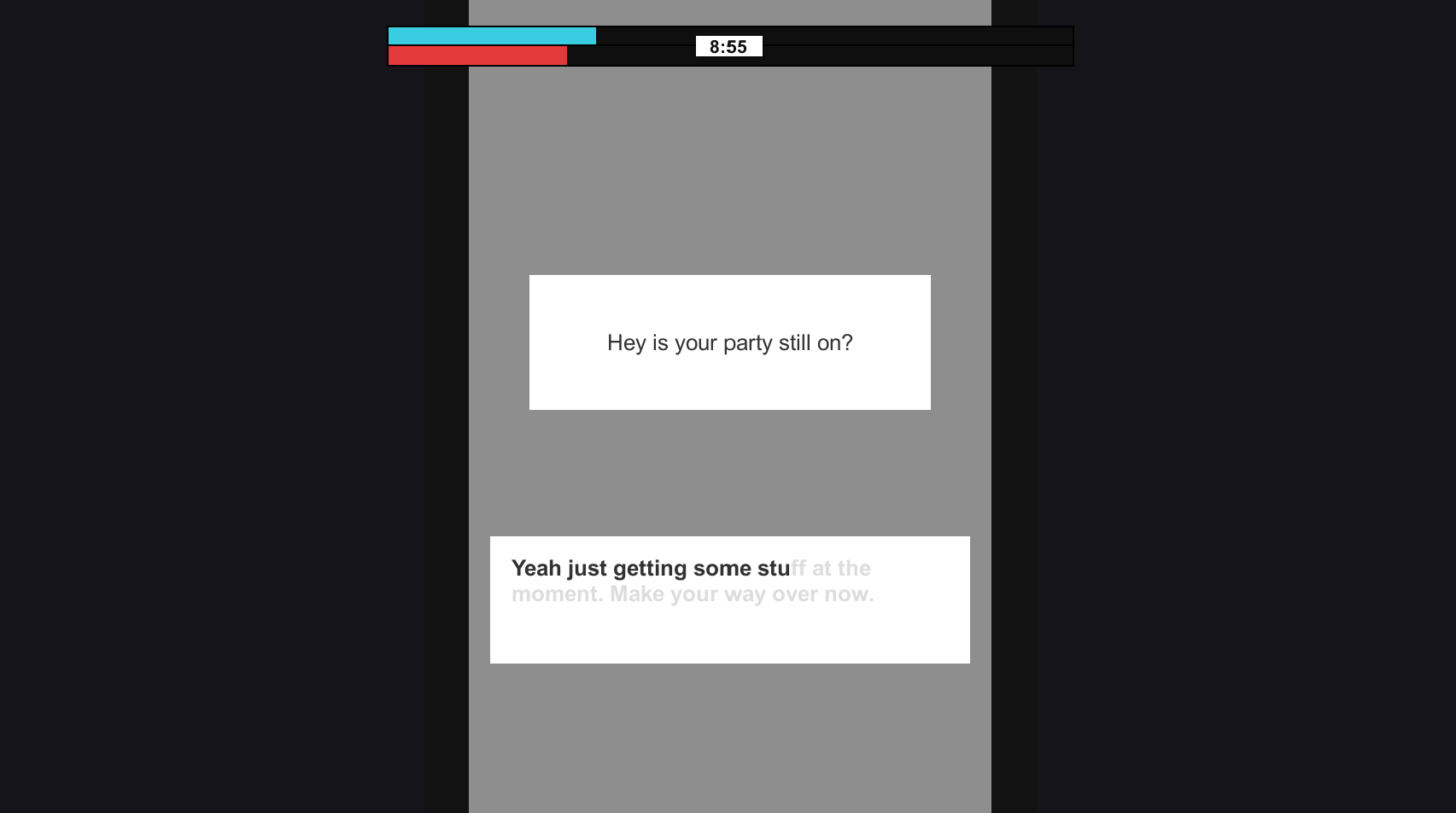
The same can also be said for the messaging scene. The same popping text can be found on the left hand side, yet along with something else. When the scene is loaded, the camera starts to zoom into the phone and rotate clockwise. This adds more movement into the scene, creating the feeling of going forward and not stopping (how the player should behave in the game). Because having a static screen for the messaging scene just didn't feel right. It felt out of place with the others where movement was occuring at all times.

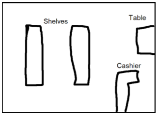
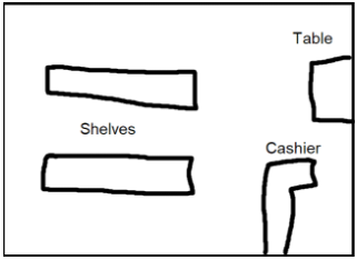
One of the largest changes in terms of documentation and the actual prototype from previous weeks, was the shop scene. I playtested the game a bit with friends and found that the shop scene was the most confusing. That is kind of intended, as you don't want the player to just fly through the scene, but it just seemed a bit too confusing. So the original shop layout was changed from the vertical shelves to the horizontal shelves.

Capture.PNG

I believe this change is quite important. Before when you loaded into the scene, only 1 shelf was visible. Where as now, all 4 shelves are visible. This prevents players wondering where an item is, only to find out that there's a shelf at the back of the store. I also added in categories on the shelves. They just give a basic word description of what's on each side of a shelf so that players can ground themselves more and understand what's going on.

Gatho at 9:00 - Dev Diary #2


It's week 2 since the project began, and week 3 since uni started up again. Most of the documentation for the game has been completed, with an art bible and asset list still in the makes. Speaking of an art bible, i've been spending some time flushing out the visual look of the game. It will be 3D, low poly and set at night.

Here's an example image from the art bible, displaying the visual look of the shop scene. Dark, small, the sort of atmosphere you only visit for a short period of time. 

The images below show off the intended look for the driving scene. Dark roads, lit by street lights with no people around.

5.PNG
 
2.PNG

A prototype has also been started on. This will just feature the base mechanics of the game and all the essential elements that are required to sell the intended experience. The more time demanding features such as models, sound effects and complex lighting will not be made for the prototype for time sake. Although later on I do intend to return to this project and flesh it out into a finished product.

The above scene you see is of course the driving scene. You have to tap differing keys on the keyboard in time to make the car go faster, com

3.PNG

Also in the past week, I added a new scene to the game. This was done to make the existing actions seem less repetitive, and push the intended experience further. The point of failure in the game for the player, is disappointing their friends. So having this scene where the player needs to frantically reply to a message adds to that and instils the sense of fear and pressure to not fail. Like the other tasks in the game, this one requires speed, by having the player spam the keyboard to fill out the message.

Gatho at 9:00 - Dev Diary #1

Our first project in studio 2, is to design a game around an experience we've had in our life. A memorable one for me, is rushing to get prepared if i'm having friends over or going to theirs. That feeling of being pressured for time and quickly scrambling to accomplish a thing, is something i'd like to replicate in a game.

So, the basis of the game, is that you are hosting a small party at your house with friends, yet you're unprepared. They all arrive at 9pm and you still need to pick stuff up from the shop and give those friends of yours a lift since they don't have a car. The game has you going through a number of different "scenes" or states. Where the player has to do certain tasks in order to progress to the next one.

These layered tasks, ticking of the clock and general atmosphere will hopefully make the player feel pressured, rushed and anxious. Because if they fail, their friends will be disappointed, as this gatho was organised weeks ago.

So what sort of things will the player be doing to create these outcomes?

  • First, there are 3 different states currently. The driving state, shop state, and friends state. Each will feature different controls and objective that needs to be completed. The better the player is at each state, will decrease their time in it, in turn: finishing the game faster, which is the goal.
  • The driving state, is what connects all the other states together. When the player needs to travel between locations, they will see on-screen the car moving along horizontally. To increase the speed of the car, there is a skill-check at the bottom. This will require the player to time tapping a certain key on the keyboard to get a speed boost.
  • The shop state, has the player controlling a first person controller. They need to find certain items from around the store based on a shopping list in hand. The similarity of many products and shelving positions will hopefully make the player feel pressured and hopefully have them running around the store.
  • The friends house state, has the player looking out of their car window at a friends house. They need to spam the space key as fast as they can, which will decrease the time that their friend has to come outside. This emulates the experience of tapping your finger when anxious/rushed for time, increasing the player's heart rate.

In terms of other features which will encourage the intended experience, those are:

  • Background music which is fast. A ticking clock can also be heard. Sort of like music you would have in a chase scene, but not as "actiony".
  • The time remaining to 9pm on-screen. This will give the player a good understanding of how long they have left, so they know if they need to hurry along faster or not. Now, it's either that option or another one i've been thinking about. And that is having the player need to hold down a button to bring up the time on their phone. This could emulate the feeling of looking down and seeing the time when you're late, with the moment of dread just before hand in not wanting to see how bad it is.
  • The general transition between the states will be instant. For example in the driving state, when the car reaches the edge of the screen, the next state will instantly appear. This adds to the urgency. It can be seen in movies, where characters in a rush are cutting from one place to another instantly. 

Kings of the Arena

Kings of the Arena, is a 2D, top down hero shooter. You can choose from a variety of characters and battle out in multiplayer against others.

download.png

Developed: August 2017 - November 2017 (development halted)

My Role: Solo Development

Type: Solo Project


Design Decisions and Process

The overall experience I intended for, was competitiveness. If you're more skilled than someone else, then you should win. The desired "easy to learn, hard to master" concept was intended. Learning the abilities and projectile types is fairly easy, as there aren't that many. Mastering the game though, involves knowing how to combine those abilities, both your own as well as other teammates'.

Each character is designed in a way to excel at a certain playstyle.

  • Archer: Tank, heavy damage, high health.
  • Mage: Defence, shield ability, stun ability.
  • Cleric: Support, can heal allies, suck health from enemies.
  • Druid: Support/damage, can create AOE effect of increased attack speed, heavy damage ability.
  • Assassin: Offensive, low health, high damage abilities.

Since the game is designed with competition and skill in mind, choosing the right combination of characters for a team is vital to success. A more skilled team will hopefully be able to play one of each of the characters, using their desired roles effectively with each other to create a team dynamic that works well.

These sort of "easy to learn, hard to master" competitive games are very common. Overwatch has characters, each with specific roles in mind, allowing for very strategic, team based games. Even a game like CS:GO, with no built in roles, players design their teams around each others specific playstyles. There's the entry fragger, support and others. Choosing who does what, where they go and how they interact with the team is what defines a bad team from a great team.

Read dev blogs.


Promised Purjury

War is approaching and nearby Kingdoms are coming to you for assistance. Some of them truly want to be on your side, yet others are trying to deceive you. Pay careful attention to what they say and their Kingdom's statistics to determine whether or not they are telling the truth.

LeCAHQ.png

Developed: January 2018

My Role: Solo Development

Type: Make-A-Thing Game Jam


Design Decisions and Process

For this game jam, we were given 3 words that the game needed to involve. Kind, thwart and blip. The idea of being kind or thwarting someone made me think of Papers, Please. So I went with a medieval variation of that game.

The overall aim was to make the player feel pressured and on edge. This was done with the following design decisions:

  • Having a timer. It's in the middle of the screen, so it's always in their view. Allowing the player to know how long they have left until failing, causes them to feel more pressured. Keep Talking and Nobody Explodes, has the players on edge and feeling pressured the entire time. With a ticking timer as well, this does indeed cause the players to hurry and feel more on edge as the game progresses.
  • Adding in more sections that the player needs to check is another way to make them feel pressured. All of a sudden they need to review Kingdom relations and travel distances. Still within the 30 second time limit, their pace of reviewing information increases as more is introduced, increasing the pressure on the player. This can be seen in Papers, Please, where new requirements are added constantly.

Read dev diary.


Country Car

This is a remake of an old 1982 Atari game, Barnstorming, in the style of the famous American painter, Edward Hopper. You play as a car, driving out from the large city to your new country home. Avoid obstacles, while going through gas stations to get to your destination.

Developed: October 2017

My Role: Solo Development

Type: University Project


Design Decisions and Process

From early playtests, it was obvious that people did not know that they had to go through the gas stations to win the game. So to communicate this mechanic without directly telling them, a gas station was placed directly in-front of the player at the start of the game. This caused them to almost always go through it.

Re-creating Edward Hopper's realistic art style was something I struggled to figure out early on. Eventually though, I went with a low poly approach, theming it to the 1930's. This was done by making the textures less saturated and having an old-timely font. Overall, I believe that even though it doesn't feature realistic painted visuals, it still relates quite a bit to Edward Hopper.

The main correlations to the artist though, was done through the setting. All things Edward Hopper painted like trains, looking out of windows, countrysides, gas stations, etc, were implemented into the game. A main aspect of his paintings was looking out of windows, which the camera appears to do in-game. Lighting was another element Hopper fondly painted. In the game there are 3 levels, each with a different level of lighting and visual style. Dusk, Dawn and Midnight. This creates both a different visual style, as well as altering the game. At Dawn, there are more potholes and at Midnight, vision is limited. These small differences create distinguishable levels, for a project we only had a few weeks on.


Janky Jousting

Janky Jousting, is a local multiplayer game where you and another person joust to the death. The knight is hard to control and with the King watching, you must perform your best. This is a game that is fun to play with a friend or two.

Developed: May 2017

My Role: Solo Development

Type: Solo Project


Design Decisions and Process

When making Janky Jousting, I had in mind that I wanted to create a party game. Games like Gang Beasts and Mount Your Friends are special because the fun comes not from mastering the game, but from playing with your friends. I've played Gang Beasts with people both online and in-person, and in-person is by far the better experience. Being able to yell at and nudge the people beside you creates the sense of fellowship and excitement.

Here are the design decisions that influence the intended party-game experience.

  • Each round is quick and goes to the next one almost instantly.
  • There is a lack of precision in controlling the knight and defeating your enemy is not really based around skill. This allows for a more even playing field. Perfect for a group of friends/party environment, where quick play-throughs are common.
  • When the lances hit each other, no one scores. This can create the sense of "I was so close to hitting you!" for each of the players, increasing the tension in the room.

There are many other games that inherit the same features to create the party-game experience. Going back to Gang Beasts, the characters are "floaty" and often hard to control. You end up most of the time spamming all the buttons to try and defeat your friends. The winner is not nessecarily the best player, as being the best player isn't what makes the game fun. The fact that anyone can pickup and play the game and have an almost equal fighting chance, is what makes it great for a party or group atmosphere. In Janky Jousting likewise, you just need to know the controls and you're off!


Make-A-Thing January 2018: Promised Perjury

Promised Perjury was a game I made for the 4 day long, Make-A-Thing game jam this month. We had three words that we needed to create something around: blip, kind and thwart. Instantly the idea of Papers, Please came to mind. The word blip then made me think of radar or some kind of detection method. My initial idea was to create a game where you had to screen aliens coming down to Earth. Check their stats, make sure they're not enemies or associated with any and make sure that what they're carrying is legal. I liked the idea but instead having it as Kingdoms coming to you, to assist you in battle, sounded better. So I began working on Promised Perjury.

I knew how I wanted it to start. A King or Queen pops up on screen, they say a few sentences of dialogue about wanting to help you in battle; then you need to decide if you accept or deny. On the left hand side, there will be stats about that Kingdom. Name, ruler, population, are they at war, etc. The player would need to look at the message and the stats to make sure what the leader is saying, is the truth. When that was being done though, it didn't seem hard. In Papers, Please there are various books and documents that the player needs to refer to and for this, I wanted to do something similar.

Capture.PNG

So I added in resource distribution. Each Kingdom will have a certain distribution of the 6 resources. Wood, stone, iron, wheat, livestock and gold. Their message could say something like: "We will supply you with weapons and armour!"

The player would then look over and see whether or not their percentage of iron is greater than other resources.

The Process

The first thing I encountered when making the game, was the process of creating the different Kingdoms. My first thought was creating a Kingdom class with all the data, then in the inspector, fill in all the Kingdoms. This of course is a bad idea, as something like that would be both confusing and easy to mess up. So my next idea was to use CSV's.

Capture.PNG

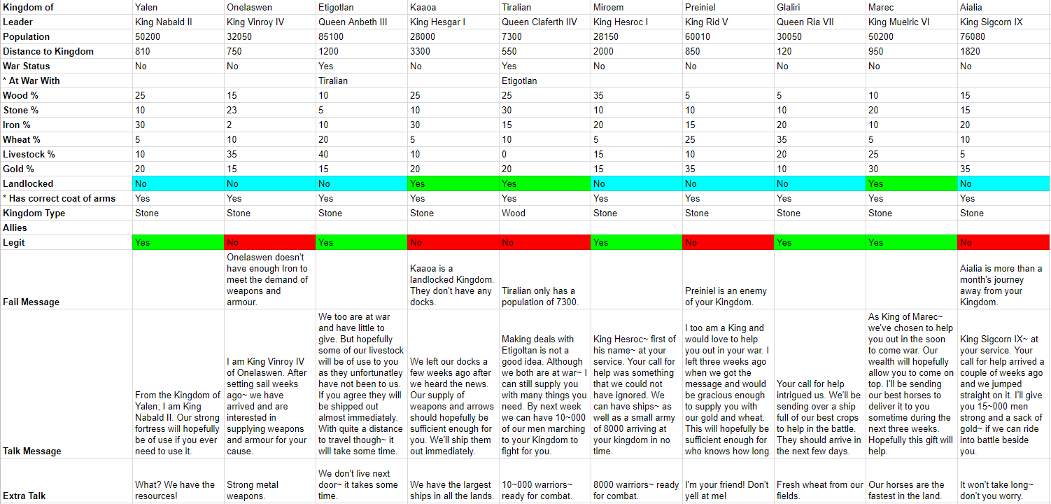
Laying it out in Google Sheets is great. You can easily visualise your levels (in this game there are 2, with each level having 10 Kingdoms). You can also colour certain cells, in this case doing so to Kingdoms whether or not they are telling the truth or not, as well as if a Kingdom is landlocked, which plays a role with some of them.

From there on, it was pretty much straight forward. Early in the project I worked on the pixel art and UI. Setting this stuff up early helped me in both encouragement to finish the game, and in giving me a platform to work from.

Designing the Game

In a game like this, where progression is based on an accept and deny button, you need to make sure that the player can't just blindly run their way through. Both in actual game mechanics and design. For mechanics, the player has the ability to make 3 mistakes before it is game over. For design, I had to make it so that patterns were kept to a minimum. The structure of the first level for if the Kingdoms were telling the truth or not was: Y, N, Y, N, N, Y, N, Y, Y, N.

I knew that the first Kingdom had to be telling the truth. This is the first thing the player comes into contact with and kicking them down straight away is not the way to go. Although the second Kingdom is not telling the truth. We need to introduce the fact that not all of them are good guys. Setting that Kingdom's iron percentage really low and saying that they will supply the weapons is hopefully an easy enough Kingdom to catch out. From there, no patterns were formed, and each Kingdom that lied, had a unique way that they lied. Some were subtle, some were more obvious than others. In level 2, Kingdom allies were introduced. Each Kingdom that came to you had a number of different allies. It was up to you to make sure that those allies weren't your enemies and also that the Kingdom wasn't at war with your allies.

Studio 1, Project 3 - Post Mortem

This is a post mortem for a project I worked on in a team, called The Gold Standard. Overall, the project went well. Our initial idea of the game and how it played out is fairly representative of the final product. Although, there were a few problems that occurred during the production.

Laying out the Levels

One of the problems I believe we had which occurred late in the production, was sitting down and documenting the layout of the levels. Us 3 games students each made many levels to reach the goal of 50. Our game was divided up into 5 stages, with each stage having 10 levels. I was given the first stage which introduced the mechanics of the game, while the other 2 team members had the other stages. This process of creating the levels happened during the last week of the project, due to systems of the game needing to be fixed beforehand. This rush of making levels caused them to be different in overall design and not really that well tested. We wanted to go for that strategic, edge of your seat experience for the player. Providing multiple possible routes, each having their own risk vs reward situation. In the end, the levels seemed bland. Each member of the team had their own way of which they laid out the levels and communication between each of us during this process was limited. We never had a document that we could refer to how the levels should play out. How many possible routes should there be? How linear or continuous should the levels be? We went out on a whim, producing levels that just looked kind of different from the previous one.

So how could this have all been avoided? Well the first thing I can think of, is a document. A level construction document was something that we started, but it just laid out which mechanics would be introduced when, not really that big of a help. The document would need to lay out: the flow of the level. How far into each level should the player come across a guard? Is it fair to have a guard see them in their starting position? In what way do rooms connect to each other? All these questions and even values should be discussed. Other things such as level time. How long should a level last? Min, max times? What is the maximum amount of time a player should be "inactive" from tapping on distractions? Most importantly, the document needs to tell the designers how they can make each level meet the desired experience that the game is trying to achieve. Communication is also something that needs to be involved. Talking between team members before, during and after a level's creation. Gaining feedback and making sure that the level meets the requirements for it to be a level. Playing each other's levels is also something that we didn't do, which we should have. In doing this, you can see how your 2 styles differ, and how you can make changes to closely seal the gap.

Source Tree Problems

We used Source Tree for the entirety of the project. It was working fine up until around half way through the project. A push or pull error led to one thing, then another, causing quite a bit of frustration and confusion for the team. The project ended up being accidentally deleted. To fix this, a new branch was made and after a bit, the project was back online, yet Source Tree was butchered in a way. Whenever we wanted to push or pull the project, we had to make sure that the correct branch was selected after making this local branch thing... it was pretty confusing. This took us a a bit of time to adjust to, yet there was something that we forgot totally. At the time the animators were pretty much done with their assets, except for a few small things. It wasn't until close to the end, when we realised that those few animators who were pushing changes, didn't push to the new branch. This was totally on us and we should have told them instantly. Luckily it didn't cause too many problems as the changes were very minor. This happened because as early game developers all we really need to know about Source Tree is pulling and pushing. We don't need to know the ins and outs of the program, so when a critical error occurs or something bad is about to happen, we're kind of in the dark. It also occurred because we never really had a schedule or talk about who will be working on what assets at what time. When multiple people are working on the same thing and they try to push or pull changes, it can cause problems. Many of these minor problems did occur almost on a weekly basis.

Getting around this problem would be done by management. Knowing who is doing what at what time. Having only one person working on one asset at one time allows for a clean push and pull to Source Tree. In the future when working in a team environment on Source Tree, we're going to be more clear about what we're working on. HacknPlan would be useful in this case. Making a task called "Working on ..." or "Implementing/improving ..." makes it clear what you're doing. Telling team members to also constrict what they change while working is great too. Going around messing with different prefabs and scripts when you don't know if you should is not a great thing to do. Making sure everyone just sticks to their task and test scene will hopefully prevent the issues that occurred with our Source Tree project.

Getting the Work Done

One thing that I believe went very well for our team, was getting the work we needed complete. Whenever there was a deadline for a certain amount of work to be done, both documentation and the actual game... most of the time it was good to go. We tested our game at every playtest, getting useful feedback to improve it upon. One of the big reasons I believe this happened, was due to laying out the tasks early on. At the start of every week and/or milestone, we laid out the tasks we needed to do for that week. This gave us an overall goal. Throughout the week then, seeing this large list of tasks encouraged us to work at it, rather than entering the tasks as we went. If that was the case, then I believe most of the work would have been done on Sunday night. Team meeting were also another big help. Every Tuesday and sometime during the rest of the week we tried to have a team meeting on Discord. In them, we would discuss what needed to be done for the week, who was to do it and to what standard we expected the work to be at by the end of the milestone. 

In the future, continuing on with this layout is certainly going to be good. Setting up the tasks day one of the first milestone sets that large objective ahead of the team. Seeing all the work that needs to be done, discourages trying to cram is all in a day before it's due. Team meetings are also obviously a good thing. Even though we had around 2 a week, I believe that we should have had more. In my mind team meetings create that "boost" of work. After one, you're encouraged to continue working on what you're doing , before that slowly drops down. Having a team meeting 3 times a week, one Tuesday, one Friday and one Sunday would evenly spread out that work flow.