This dev diary will cover week 3 and 4. The prototype is pretty much complete, along with the documentation. Expanding upon the idea of trying to pressure the player and make them rush, I've added in a few new things.
In the friend's house scene, I added in some text: "Your friends can't hear you! Beep your horn!" This text pops in and out to emphasise it. This first of all, draws the player's attention to provide context on what's going on. And secondly, it encourages fast behaviour. The quick movement of the text makes it so the player feels like they need to go fast.
The same can also be said for the messaging scene. The same popping text can be found on the left hand side, yet along with something else. When the scene is loaded, the camera starts to zoom into the phone and rotate clockwise. This adds more movement into the scene, creating the feeling of going forward and not stopping (how the player should behave in the game). Because having a static screen for the messaging scene just didn't feel right. It felt out of place with the others where movement was occuring at all times.
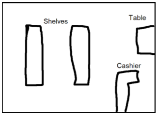
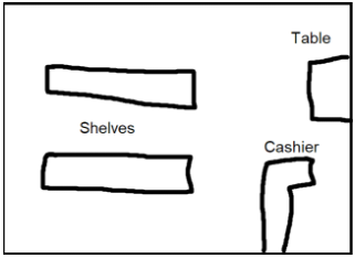
One of the largest changes in terms of documentation and the actual prototype from previous weeks, was the shop scene. I playtested the game a bit with friends and found that the shop scene was the most confusing. That is kind of intended, as you don't want the player to just fly through the scene, but it just seemed a bit too confusing. So the original shop layout was changed from the vertical shelves to the horizontal shelves.
I believe this change is quite important. Before when you loaded into the scene, only 1 shelf was visible. Where as now, all 4 shelves are visible. This prevents players wondering where an item is, only to find out that there's a shelf at the back of the store. I also added in categories on the shelves. They just give a basic word description of what's on each side of a shelf so that players can ground themselves more and understand what's going on.


