These posts might actually come out more often than I mentioned. I've been working quite a lot on the project and I think that there's enough progress for an update.
There's quite a lot of stuff to process in that GIF. The first thing you saw, was probably the character select screen. Whenever a player joins a game or dies, that screen pops up, allowing them to select a character to spawn as.
I've added screenshake when you get hit. This still needs tweaking.
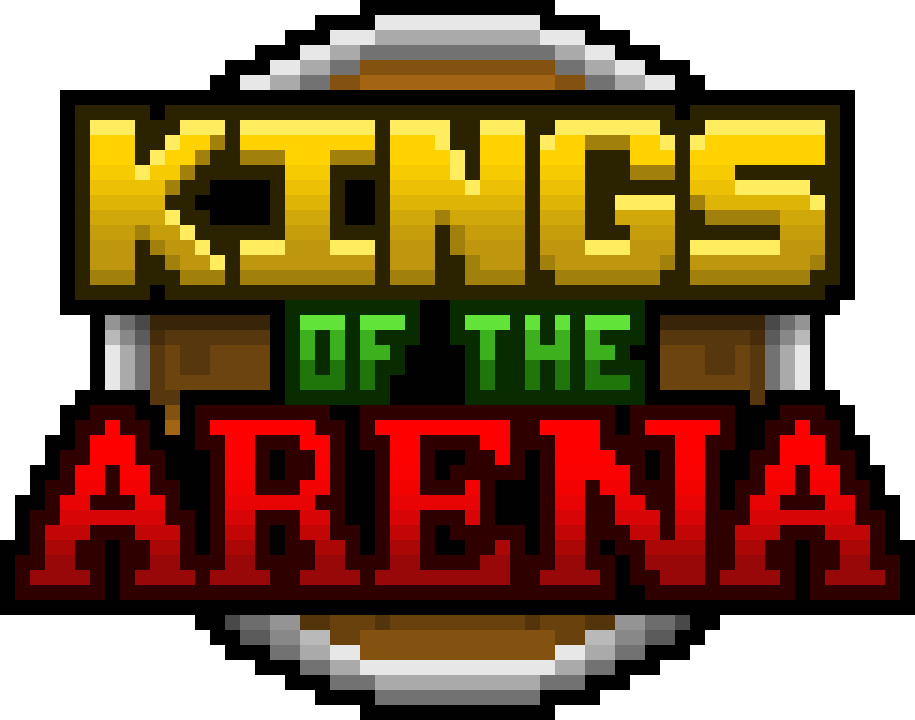
Here's a logo that I whipped up. Probably not the final version, but I really like it.
That's the character roster. The Druid also finally has a skin. When drawing the sprites for the characters, I wanted them each not only to have a distinct colour, but to also have distinct features.
- The Archer is the base/default look.
- The Mage has a beard.
- The Cleric has a mask and hair.
- The Druid is bald.
- The Assassin's face is almost all cloaked and they don't have brown shoes.
I've also been messing around with followers. One of the Druid's abilities, is to spawn a follower that can attack nearby enemies. At the moment it can just follow the player around and look in the direction of the player.
I'm still wondering if it should attack automatically when enemies are nearby, or attack when the player attacks. If when the player attacks, then should it find an enemy in that direction and shoot towards that, or just in the same general
Above are the current projectiles that I have made for the game. Look at them and think what a major problem would be in-game... They blend into the ground too much. If you are running around trying to fight other people, a core part of the game is being able to avoid enemy projectiles.
The rock, health shard and ice shard blend in too much with the ground.
The fire ball for example. When it moves, there is a trail and particle effect attached to it. It's easy to see.
Then there's the rock, which when moving is not that easy to see. It blends in with the pattern of the grass, even though it's a different colour overall. I believe a solution would be to add a trail like the fire ball or make the rock spin as it's being thrown. This will hopefully make it stand out more.
Since each character will have 2 unique abilities, i've been working on a modular ability system. First, I though about the different types of abilities. These are: projectile, self, placeable, follower and allies.
- Projectile abilities, are like normal attacks but can have higher stats and different effects attached.
- Self abilities, are cast on the player themselves. Temporarily giving them extra stats like armour or attack speed.
- Placeable abilities, are objects that the player can place. Like mines, goo or turrets. These are just ideas at the moment though.
- Follower abilities, are spawnable creatures that can help the player in different ways. This can be attacking enemies, healing the player over time or other things.
- Allies abilities, are abilities that affect the entire team or nearby teammates. This can be a heal, armour or other things.
Each player has an Ability Manager, which sets abilities when a new character is chosen, casts those abilities and manages cooldowns. Each Ability class contains the basic data. Like name, description, cooldown, sprite icons. Everything that all abilities have.
Then there are the 5 (so far) distinct ability classes. These are ProjectileAbility, SelfAbility, PlaceableAbility, FollowerAbility and AlliesAbility. They each are contain data for that specific ability type. Each Ability class connects to one of these distinct ability classes. I know it's not that well explained, just know that doing this allows for modular abilities. So adding new ones or changing existing ones in the future is much easier and faster.


